Project Properties
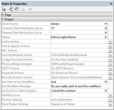
Project properties are defined in the Styles & Properties Pane and are described below. If you place your mouse over the property name, a popup appears that contains a brief description of the property.
This option specifies the level of server access while the solution runs. The default is always.
•Always: Connection to the server is required in order to run the solution. The server is continually accessed while the solution runs. •On Demand: The MobileTogether Client app runs the solution on its own; it connects to the server only when it needs to exchange data with the server. To run the solution, the app uses data in the internal $PERSISTENT tree, other persistent data, or embedded data. You can use the XPath function mt-has-serveraccess to check whether a server connection exists, and then use actions to save appropriately. For example, if no connection exists, then the data can be saved as persistent data on the client. As soon as a connection to the server is established, data can be saved to databases and/or files on the server. •Never: The MobileTogether Client app runs the solution entirely on its own and without needing a connection to the server or any data from the Internet.
|
The amount of time the client waits for a response from the server. The value is an integer value in seconds that can be entered or selected from the dropdown list of the combo box. The default value is 15 seconds. If the timeout period is exceeded, then an error message is displayed on the client.
|
This is the amount of time the server waits for data to be retrieved from a source external to the server (from a DB or URL, for example). The value is an integer value in seconds that can be entered or selected from the dropdown list of the combo box. The default value is 10 seconds. If the timeout period is exceeded, then an error message is displayed. An exception to this is when load actions have the setting On error set to Continue. In this case, the On Error actions of that action's Continue setting are executed.
|
Three options are available: (i) Use System Settings, (ii) Enforce Light Theme, (iii) Enforce Dark Theme. The default is Use System Settings. A light theme is one in which dark text is displayed on a light background. A dark theme is one in which light text is displayed on a dark background. If the style definition is Use System Settings, then the choice of theme is determined by the user's device.
|
Audio events are defined globally for the entire project. Three events are available: OnAudioStarted, OnAudioError and OnAudioCompleted. The actions that are defined for these events apply to all Audio playback events in the project. Clicking the property's Additional Dialog button displays a dialog containing the definitions of the project's Audio events. For each event, you can define the actions to perform by dragging and dropping actions from the left-hand Actions pane into the event's tab. For more information, see the description of the Audio (Playback) feature.
|
When you click the Additional Dialog button of the property the Text to Speech actions of the Project Actions dialog are displayed (see screenshot below). 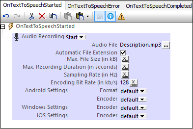 The following Text to Speech events are available:
•OnTextToSpeechStarted: Actions specified in this pane are executed in sequence as soon as playback of a Text to Speech action starts. For example, as shown in the screenshot above, an Audio Recording action can be started to record the Text to Speech playback in a file. •OnTextToSpeechError: Actions to execute if there is a Text to Speech error, such as the text not being found. •OnTextToSpeechCompleted: Actions to execute when a Text to Speech playback is completed. You could, for example, start another Text to Speech playback by specifying a Text to Speech action for this event.
|
Enables actions to be defined for two NFC-related events:
•OnPushNdefMessageCompleted specifies what action/s to carry out when the transmission of NFC data (via NFC Push) has been completed. •OnNfcTagDiscovered specifies what (additional) action/s to carry out when an NFC tag is discovered.
Click the property's Additional Dialog button to go to the definitions of the two events. See NFC-related events for more information.
|
At design time, opens the OnPushNotificationReceived event tab, in which you can specify the actions to carry out when a push notification is received. When an action is added to the event, then the $MT_PUSHNOTIFICATION page source is automatically added to the design.
When a push notification (PN) is received on a device, one of two alternatives is carried out depending on the If solution is already running on reception setting:
•The $MT_PUSHNOTIFICATION page source of the receiving solution is silently updated with the PN's payload, and the actions in the OnPushNotificationReceived event tab are executed. All of this is done directly, without displaying the PN. •The PN is displayed. When the user taps the PN (or a button in the PN), the following happens: (i) The solution to start is opened if it is not already running; (ii) The solution's $MT_PUSHNOTIFICATION page source is updated with data from the PN's payload; (iii) The actions in the OnPushNotificationReceived event tab are executed.
See Push Notifications for more information.
|
The In-App Purchase Actions button takes you to the Actions dialog for the OnPurchaseUpdated event. During an in-app purchase, after the end user on the client device confirms a purchase, the app store sends data about the purchase to the device. The data will be stored in a new Purchase element of the $MT_IN_APP_PURCHASE page source. It is when this update to the page source occurs that the OnPurchaseUpdated event is triggered. In the Actions dialog of the OnPurchaseUpdated event, you can define actions that you want to perform at this point in the in-app purchase process. Typically, you would (i) check the response code of the purchase transaction for success/failure, and (ii) acknowledge the purchase.
See the topics Purchase Products and Example Project: The "Buy" Button for more information.
|
When a phone setting is changed, this is an event (OnPhoneSettingsChanged), for which you can trigger a set of any of the standard actions. Click the Additional Options button at the right of the project property to define the set of actions you want to execute when this event is triggered. The event would be triggered when any phone setting is changed, for example, the theme or the language.
|
In addition to setting actions to perform at the page level when an MQTT message is received, you can also set actions at the solution (or project) level. The project-level actions will be triggered when an MQTT message is received on any page of the solution and if no page-level MQTT actions have been defined for that page. The actions at project-level also enable you to use a single set of actions across all pages.
To define project-level actions for MQTT messages, click the Additional Options button at the right side of the MQTT Actions setting and then add the actions you want to define.
|
When a broadcast message is received in a solution, actions to perform can be defined in the Broadcast Actions of the project. If no actions have been defined for the OnBroadcastReceive page event of the currently active page, then the Broadcast Actions of the project are executed—if defined.
To define the project's Broadcast Actions, click the Additional Options button at the right side of the Broadcast Actions setting and then add the actions you want to define.
|
The Barcode Scanner Actions property defines the actions to perform when events related to barcode scanners are triggered (see screenshot below). You can define a sequence of actions for each of the following events, the names of which are self-explanatory:
•Zebra Scanner OnConnectionEstablished •Zebra Scanner OnDataReceived •Zebra Scanner OnConnectionTerminated •Zebra Mobile Computer OnDataReceived •Datalogic Scanner OnDataReceived
The screenshot above shows the definition of an action to execute when a connection to a Zebra scanner is established (event = Zebra Scanner OnConnectionEstablished).
After the solution connects to a scanner, the data of any barcode that a scanner reads is sent to the solution and stored in the relevant page source tree. The OnDataReceived event handlers for the different scanners enable you to specify what actions to perform once the barcode data has been received in the page source.
To define the project's barcode scanner actions, click the Additional Options button at the right side of the Barcode Scanner Actions setting and then add the actions you want to define. For an overview of how barcode scanners work, see the topic Barcode Scanners.
|
A boolean setting that sets whether the user is asked to confirm (workflow) solution exit. Select true or false in the combo box. Default value is true. If true, the text defined as the value of the next property, Exit Workflow Message, is displayed before the solution exits. A situation in which the user is asked typically arises if the user presses the Back button on the first page of a solution. The user will not be asked for an exit-confirmation if the Submit button is pressed or if a Cancel Action Execution is processed.
|
The text of the message that is displayed as a prompt to confirm (workflow) solution exit. The message is displayed only if the previous property, Ask User on Exit Workflow, is set to true. The default message is: Do you really want to exit this solution?
|
While a solution is running, the end-user could switch to another solution. If this happens, the On Switch to Other Solution setting determines whether the original solution is suspended (paused and minimized), or canceled. If the solution is suspended, then the solution is paused at that point, and no further solution action is executed: for example, no timers are executed, no geolocations are used. When the solution is resumed, actions defined for the On Reopen option of the OnPageRefresh event are executed. The setting's options are:
•Cancel this solution: The default value. The solution is canceled; any unsaved data will be lost. •Suspend this solution: The solution is paused but is kept open. Its icon will become available in the device's Running tab. To switch back to the solution, the end-user clicks the solution's icon in the Running tab.
Note: To test this property, the solution must be deployed to the server and run from there.
Note: Also see the Solution Execution action, which is another way to specify whether a solution is canceled or minimized.
Note: Web clients do not support suspended solutions; only the active solution is supported.
|
Clicking the property's Additional Dialog button displays a Browse dialog in which you can browse for the PNG image file to use as the icon of the project on client apps. The maximum pixel size of workflow icons is 200x200. By default, the MobileTogether icon will be used.
|
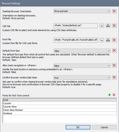
Clicking the Browser Settings property's Additional Dialog button displays the Browser Settings dialog (screenshot below). Here you can define certain settings related to the browser of the mobile device. These settings are described below. The following settings can be defined:
Desktop Browser OrientationThe combo box options enable you to select the orientation of the browser: Force Portrait and Force Landscape. The default is Force Portrait.
CSS FileFor styling in web clients—that is, in browsers—only, this setting specifies the external CSS file that is read in order to evaluate CSS properties assigned to the class selectors of controls in the design. An external CSS file can be modified at any time in order to change the appearance of design components. Each design component has a property called Browser CSS Class, which defines a CSS class name specific to that control. CSS properties for these class selectors can then be defined in an external CSS file, which is deployed to the server. The CSS file to look up for the class rules is specified in this (CSS File) setting. You can select the CSS file via a file path or global resource alias. You can also use an XPath expression to generate the file path (see screenshot above). Note the following points: (i) the CSS rules defined in the external CSS file have a lower priority than the definitions that are made in a control's properties; (ii) the CSS file is not available in simulations for web browsers.
Font FileSpecifies one or more font files that you want to embed in the design and use in addition to the system fonts. You can either browse for the font file, locate it with a global resource, or generate its filepath with an XPath expression. The following font file types are supported: .ttf, .otf, .woff, .woff2. Additionally, MobileTogether will correctly generate .eot, .svg, and .svgz fonts; however, these font file types are not supported by all browsers. If you want to embed multiple font files, enter an XPath expression which is a string containing the multiple filepaths separated by commas (see screenshot above). A font that is embedded in the design in this way can be referenced via the font-family property of CSS. If a font has been embedded that is also available on the local system, then the system font will be used. If you specify the same font in different file types (say, WOFF2 and TTF), then the browser will download the one file type that it supports best, and none of the alternative file types. For more information about CSS and browser-related font information, see the following MDN web pages: @font-face and font-family.
Allow Back Navigation in <iframe>This property applies to Embedded Webpage Solutions, which are solutions that are loaded into an IFrame element of a webpage. If this option is set to true, the Back navigation button of the browser allows the end user to navigate back within the IFrame. The default is false.
Default Font SizeSelect the base font size from which all control font sizes are calculated. The Browser Default option selects the default size of the browser. The default option is 16px.
Confirm Browser Window/Tab CloseThis option enables a message box to be displayed when the end user wants to close the browser window or browser tab that is displaying the solution. The message (i) asks whether the user really wants to leave the page, and (ii) informs the user that if he or she clicks Leave, then unsaved changes might not be saved. This setting applies to all pages in the project. If this option is selected, and you want to disable it for one or more pages individually, then you must set the Browser CSS Class property of each of these pages (see Page Properties) to a value of mt-no-browser-exit-confirmation.
Fonts for Rich Text ControlAdd the fonts you want to allow the end user to select from. These fonts will be displayed in the dropdown list of the font selection combo box of the Rich Text Control. If no font is specified in this list, then the font selection combo box will be disabled in the solution.
NoteRelative file paths that are set in this dialog are relative to: (i) the solution directory on the server, and (ii) in MobileTogether Designer, to the directory in which the design is located.
|
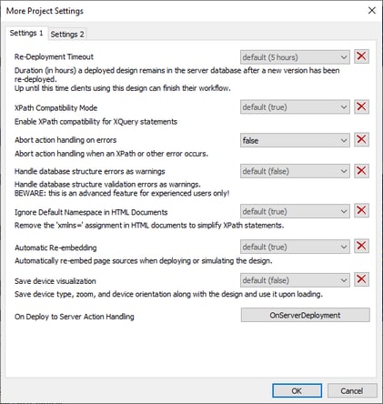
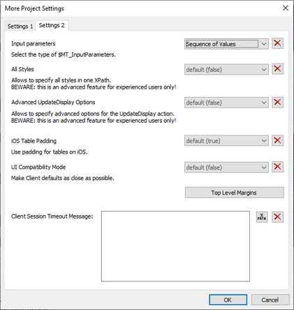
Clicking the More Project Settings property's Additional Dialog button displays the More Project Settings dialog (screenshot below). Note that settings are divided across two tabs. The following settings can be defined:
•Re-deployment Timeout: The time in hours after a new version of a solution is deployed that the superseded solution is kept on the server. This overlap time enables clients currently using the older solution to complete work. The default is 5 hours.
•XPath Compatibility Mode: When set to true, XQuery constructs that are invalid in XPath are resolved so that XQuery statements containing these constructs are compatible with XPath and can be used where XPath expressions are allowed. Currently, this concerns XQuery entity and character references, which are allowed in XQuery, but not in XPath. When XPath compatibility mode is set to true, XQuery entity and character references are read in XPath as text; they are not resolved. The default value for this setting is true.
•Abort Action Handling on Errors: Aborts the handling of actions when an error occurs. The error could be in an XPath expression or elsewhere in the action handling. However, minor errors such as XPath errors for selecting a style property are ignored and action handling continues. The default value is true.
•Ignore Default Namespace in HTML Documents: Since only one default namespace is allowed in an XML document, not ignoring the default namespace in HTML documents could create errors in reading XML data sources. The default is true: The HTML default namespace is ignored.
•Automatic Re-embedding: Embedding refers to the embedding of page sources in the project (design) file. If Automatic Re-embedding is enabled (true), then page sources are re-embedded when deploying or simulating, ensuring that the latest data source files are embedded and that the data, therefore, is up-to-date. The default is true.
•Save Device Visualization: If selected, then the device settings (device type, zoom level, and page orientation) will be saved with the design. The design will be re-opened with the last-saved device settings. The default is false.
•On Deploy to Server Action-handling: On clicking OnServerDeployment, an Actions dialog for the OnServerDeployment event is opened. You can enter a sequence of actions to be performed when the project is deployed to the server. Only server-related actions can be added to this action tree, and only these actions will be enabled (that is, those actions that are not grayed out). During the action-handling the server is locked, and clients will not be able to connect to it. The values of input parameters for these action are submitted during the deployment step. During deployment, the parameter values will be passed to the solution's $MT_InputParameters variable and can be accessed from there. Note that the data structure of the $MT_InputParameters variable is specified in a project setting (see next setting).
•Input Parameters: Specifies the data structure type of the $MT_InputParameters variable. The options are: (i) Named Parameters, which is a map data structure (for example: {"name":"Altova", "location":"Boston"}) and (ii) Sequence of Values, which is a sequence data structure (for example: ("Altova", "Boston")). The default is Named Parameters. For more information, see the descriptions of MT_InputParameters, the previous project setting above, On Deploy to Server Action-handling, and the Deploy to MobileTogether Server command.
•All Styles: This setting specifies whether the All Styles property of a design component or page is available or not. The setting's values are true or false, with false being the default. If set to true, then the All Styles property will be displayed in the Styles & Properties Pane. The property enables you to set all the styles of the selected component or page conveniently at one location, via an XPath map expression. For information about how to use the All Styles property, see its description, for example, on the Button control.
•Advanced UpdateDisplay Options: Specifies whether the Update Display action offers advanced options (true) or not (false). The advanced options enable you to specify which controls of a page are updated. If advanced options are not switched on, then all controls of a page are updated. The default setting is false. For details about the Update Display action's options, see Update Display.
•iOS Table Padding: Specifies whether the standard iOS table padding is applied to tables on iOS devices. The default value of this setting is true. When the setting is true, all tables in the project are given a padding of 9px on right and left, and 5px on top and bottom. If values are also set for any Padding property of individual tables, then that Padding value (top, right, bottom, or left) is added to the respective iOS table padding value. If iOS Table Padding is set to false, then the default iOS table padding will not be applied, and only the padding values you set for an individual table will be applied. Note that the iOS Table Padding setting applies to iOS tables in the entire project.
•UI Compatibility Mode: Some default style properties are handled differently by client devices on different platforms. The UI Compatibility Mode setting's default value is false. Set it to true if you want the styling defaults of design components to be similar across platforms. As a result, the default of incongruent style values will be modified. For example, iOS table padding is set to false, top-level margins are set to 0px for all devices, and button padding is set to 0px on Android and 1dp on other platforms. Note that the UI Compatibility Mode setting modifies default styles. You can set custom styles in the usual way. For a list of default style values that are different across platforms, see Style Variance Across Clients.
•Top Level Margins: Top-level controls are controls that are located directly inside the design—that is, these are any control that is not inside a table. The margin you set in the Top Level Control Margins dialog will override the default device-specific margins. They essentially set a margin for each page of the project, and thus provide you with better control of the layout. For example, Android devices currently set a default margin of 9px (but see note about Label controls at end of para); if you want another margin for your project pages, you can use Top Level Margins to adjust the margin. The Top-Level Control Margin property Default for all sets the specified margin on all four sides. You can also set the top, right, bottom and left margins individually. If a margin setting is left blank, the default device-specific margin is used. (Note: Label controls on Android have a bottom margin of 0px. To modify this setting, either change the top level margin setting (this setting) or the bottom margin of the Label control.)
•Client Session Timeout Message: You can enter a message to be displayed on the client device when the when the server has timed out. The message can be either entered directly or it can be obtained as the result of evaluating an XPath expression.
|
