Rich Text Style Sheets: Styles
After a Rich Text style sheet has been created, style rules and mappings are defined in different sections of the Rich Text Style Sheets dialog. These rules and mappings are concerned firstly with the conversion of styles in the XML of the page source into HTML that can be displayed on client devices. In the case of web clients and Windows clients, rich text content can be edited and formatted by the end user. The rules and mappings are therefore also used to pass any modified HTML styles back to the XML page source.
In the Rich Text Style Sheets dialog, the style rules and mappings are organized into sections. Each of these sections is described below:
Attribute Style Mappings
The attributes defined in this section (see screenshot below) map attributes of the same name in the page source to content in the Rich Text control. The mappings apply to attributes of all elements in the page source. Any attribute defined here describes how its parent element will be styled. Conversely, any attribute that is not defined here does not pass any styling to its parent element.
You can add an attribute to the list of styled attributes by clicking Add Style in the toolbar of the right-hand pane and entering the name of the attribute.

Note the following points:
•Use As Is expects content of the attribute in the page source to be valid CSS.
•CSS: Takes one or more CSS property–value pairs. If you want to use a property value from an attribute in the XML page source, use $value to get the value of that attribute. For example, if an element in the page source has an attribute named format so that: (i) <myelement format="red">...</myelement> and (ii) the format attribute is defined in the style sheet as shown in the screenshot above, then the entire value of the format attribute, that is red, replaces $value in the style definition. So, for myelement, the style definition (obtained from the style definition of the format attribute) would resolve to: font-weight:bold; color:red. If another element had @format="blue" in the page source, then that element's style definition would resolve to: font-weight:bold; color:blue.
•If an element in the XML page source has two attributes for both of which Use As Is style definitions exist in the style sheet, then the two style definitions are combined for styling that element.
Examples
•If the attribute definitions shown in the screenshot above are applied to the following element in the XML of the page source:
<heading style="font-style:italic;" global="font-weight:bold;">Text Formatting</heading>
then the resulting style definition will be font-style:italic; since the @style attribute is used as is. The @global attribute is ignored because it is not defined in the style sheet.
•If the attribute definitions shown in the screenshot above are applied to the following element:
<heading format="red">Text Formatting</heading>
then the style that will be applied will be font-weight:bold; color:red; because this is the definition of the format attribute in the style sheet.
Element Mappings
Each element mapping (see screenshot below) defines certain properties for the listed elements. You can do the following:
•Define the CSS style properties of the element. Note that the style properties of elements can also be defined via attributes in the Attribute Style Mappings section; avoid defining the same property in two locations.
•Specify whether an element is a block element (corresponds to HTML div) or an inline element (corresponds to HTML span). The default setting is block; so, by default, the content of every element would appear in the solution on a new line unless specified here as being inline. Inline elements, on the other hand, occur within a line. Common inline elements are those that mark up text within a line as bold or italic. In the screenshot below, note which elements have been specified as being inline.
•Specify what attribute/s of an element will hold the element's style properties. These attributes will be the attributes in the XML document to which styling properties are written (from the client).
•If a block element has been defined to have an attribute to hold styles (see previous point), then, when the end user places his or her cursor inside this element's content, the text-alignment icons (left, center, right, justify) are automatically enabled in the control's toolbar. If the end user applies text-alignment to the element's content by tapping a text-alignment icon, then that icon's style value is written to the attribute that was defined to hold the element's style properties. For example, if the end user places the cursor in the text of the color-caption element and taps the Right-align icon, then the text will be right-aligned in the control and a CSS property-value of text-align:right will be stored to the formatting attribute of that color-caption element—if, as in the screenshot below, it is formatting that is specified as the attribute to hold the color-caption element's style properties.

You can add an element to the list by clicking Add Style in the toolbar of the right-hand pane and entering the name of the element you want to define.
Element Child Rules
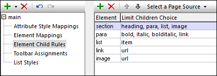
The rules in this section (see screenshot below) define what child elements an element can have. The list of child elements you enter does not need to match the complete list of all child elements allowed by the schema; it is the list of child elements that you wish to allow the end user to add when editing content in the Rich Text control. If an element is not listed here, then all elements will be available as children of that element.
You can add an element to the list by clicking Add Style in the toolbar of the right-hand pane and entering the name of the element you want to define. In the next column, enter a comma-separated list of the names of child elements.

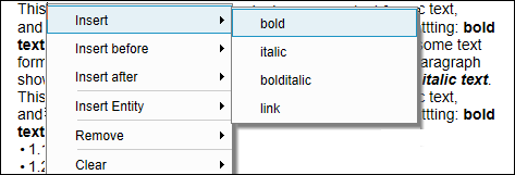
In the screenshot above, for example, a para element is defined to have the following children: bold, italic, bolditalic, and link. If the end user, while editing content in a Rich Text control that uses this style sheet, right-clicks inside the para element, then the context menu shown in the screenshot below appears. The elements that can be inserted are those that were defined as children of the para element.

Toolbar Assignments
When the Rich Text control is displayed in the solution of a web client or Windows client, the content that is displayed in the control is editable. On these devices, an editing toolbar (see screenshot below) is displayed in the top part of the control. The end user can click an icon in the toolbar to assign that icon's style selection to the selected text content.

It is in the Toolbar Assignments section of the Rich Text Style Sheets dialog (screenshot below) that you map XML elements to toolbar items. In the screenshot below, for example, (i) the italic icon (selected in the combo box in the Style column) is mapped to an element named italic; (ii) the bold icon is mapped to an element named bold; and (iii) the text color selection is mapped to an element named color-caption. When the end user clicks a toolbar icon or makes a selection in one of the combo boxes of the toolbar, then the styling associated with that toolbar item is applied to the selected text.
At the XML level, the element that has been mapped to that toolbar item is created around the selected text; if this element does not have any style associated with it, then an attribute containing the relevant style is added to the element. For example, in the screenshot below, since the italic element has been assigned an italic style in the Element Mappings section of the dialog, creating the italic element around a text selection (by clicking the italic toolbar icon) will cause the text selection to be displayed in italic. In the case of the text color toolbar item shown in the screenshot below, no style property has been defined for the color-caption element (see the screenshot in the Element Mappings section) . As a result, the text color that the end user selects in the toolbar will be stored in the formatting attribute of the color-caption element. To which attribute of an XML element styles from the edited solution are mapped is specified in the element's definition in the Elements Mapping section (see the definition of color-caption in the screenshot there).

You can add an element to the Toolbar Assignments list by clicking Add Style in the toolbar of the right-hand pane and entering the name of the element. In the next column, select the corresponding toolbar item from the combo box. (All the available toolbar items are listed in the dropdown list of the combo box.)
| Note: | When the cursor is placed at a location where a toolbar-based style cannot be applied, then that toolbar item is disabled. |
| Note: | When a deployed solution is opened on a client for editing, toolbar items that have not been mapped to an element are not displayed. In the designer (during simulations), however, these toolbar items are displayed, but they are disabled and shown with a red border; if you place the cursor over one of these toolbar items, a tool tip informs you that a mapping for that toolbar item has not been defined. In this way, you can distinguish between toolbar items that are disabled because of the cursor location (see previous note) and toolbar items that are disabled because they have not been mapped. |
List Styles
List styling is available for two types of list structure:
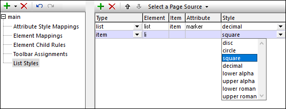
•Container list (editable marker applies to entire list): A list structured as a list element containing list-item child elements. For example: <list> <item/>...<item/> </list>. In the screenshot below, the first definition is that of a list of this type. The end user can change the list marker character (for example, whether the marker is a number or a square) of the entire list. You, as the designer, can define the initial marker of the list.
•Item-sequence list (editable marker applies to individual list items separately): A list consisting of a sequence of list-item elements, with no containing list element. For example: <li>aaa</li>...<li>nnn</li>. In the screenshot below, the second definition is that of a list of this type. The marker characters of individual list items can be edited by the end user; all the markers cannot be edited together at once.
The end user can edit the content of both types of list, and add and delete list items (see Editing Rich Text Content).
| Note: | The selected marker determines whether the list is a numbered list or itemized list. |

To define list styles (refer to the screenshot above), do the following:
1.Add an entry for a list by clicking Add Style in the toolbar of the right-hand pane.
2.In the Element column: for Container lists, enter the name of the element that corresponds to the list; for Item-sequence lists, enter the name of the list-item element.
3.In the Item column: for Container lists, enter the name of the element that corresponds to the list item; for Item-sequence lists, enter nothing.
4.In the Attribute column: for Container lists, enter the name of the attribute that will hold the name of the list marker; for Item-sequence lists, enter nothing. When the end user selects some other marker for a Container list than the initial marker, the new marker name is entered in this attribute, and the list is styled on the basis of this attribute's value.