Controls and Control Events
The controls that appear in a page determine the design of the page, both in terms of functionality as well as of appearance.
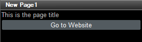
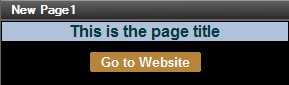
For example, if you wish to make a simple page that consists of (i) a page title, and (ii) a button that links to a website (see screenshots below), then you would add two controls to the page: (i) a label control that displays the page title, and (ii) a button control that links to the website. The website page is opened when the end user clicks the button. The click triggers a button action that links to the website. In this way, the button control provides functionality. At the same time, the two controls can be styled by specifying a wide range of properties for the two controls (label and button). These properties range from color, dimensions, and positioning to a setting that enables or disables end-user interaction. Styling in this way enables you to determine the appearance of not only the controls, but also of the page as a whole. The screenshots below show the same two controls styled with two different sets of properties.
How to use controls
All the controls that are available in MobileTogether are displayed in the Controls Pane. To add a control to the design, drag it from the Controls Pane and drop it at the required location in the page design. You can then do the following:
•Link the control to a page source node (available in the Page Sources Pane) so that data from a node in the page source can be displayed in the design and processed. Typically, an association between a control and node is defined by dragging a data node from its source tree (in the Page Sources Pane) onto the control. Such an association is called the page source link of the control.
•Set control actions: You can add one or more control actions to execute when a control-related event is triggered (for example, when a button is clicked). Define control actions by right-clicking the control and selecting Control Actions. The available actions are described in the section Actions.
•Set control properties: The properties of a control define the control's appearance (including it position on the page). To set a control's properties, select the control and set its properties in the Styles & Properties Pane. The properties of controls are described in the section Controls. Note that it is the properties of the controls on a page that determine the appearance of the page.
In this section
This section is organized as follows:
•Controls describes each control separately: its function, its properties, and its event/s (for example, the button control has one event, the OnButtonClicked event)
•Control Events lists, in one table, the events of various controls