Controls
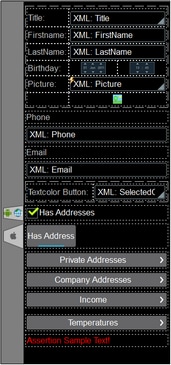
A page design (screenshot below) consists of page controls—such as combo boxes, tables, and images—that are laid out and formatted exactly as the end user will see the page. Controls are dragged into the design from the Controls Pane. After a control has been placed in the design, you can do the following:
•Controls can be linked to page source nodes (available in the Page Sources Pane) so that data from these nodes can be displayed in the design and processed. Typically, an association between a control and a page source node is defined by dragging a node from its source tree (in the Page Sources Pane) onto the control. A node association of this type is called the page source link of the control.
•Set control actions: Control actions determine the functionality to be executed when a control-related event is triggered (for example, when a button is clicked). You define control actions by right-clicking a control, and selecting Control Actions. Control actions are described in the section Actions.
•Set control properties: The properties of a control define the control's appearance (including position). Consequently, a control's properties also define the appearance of the page. To set a control's properties, select the control and set its properties in the Styles & Properties Pane. Each control's properties are described in the sub-section of this section.
•When the control is associated with a data source node (page source link), placing the mouse over the control (in Page Design View) displays the associated node in a popup. •All page source links in the page source tree are displayed in a bold font. Tree nodes that are not page source links are displayed in normal font. •Placing the mouse over the page source link in the design tree displays information about the associated control. •To remove a data-source node association (and therefore the data in the control), right-click the control (in Page Design View) and click Unassign Page Source Link <NodeName>. •To reset a style or property (in the Styles & Properties Pane), select the property and click Reset in the pane's toolbar. •The values of several properties can be set by using XPath expressions. This allows values to be dynamic: that is, generated via calculations, or from data source nodes, at runtime. To set an XPath expression, click Edit XPath in the toolbar of the Styles & Properties Pane. •To edit the XPath expression of a style or property (in the Styles & Properties Pane), select the style or property, and click Edit XPath in the pane's toolbar. •To copy a control to another location in the design, press Ctrl and drag-and-drop the control to the desired copy location. •To assign specific properties for a control, define one or more classes for the control (via the Browser CSS Class property), and then assign rules for the class/es in an external CSS file (that you specify in the Browser Settings dialog). •A control's CSS properties can be defined in the Styles & Properties Pane and/or in an external CSS file. Those defined in the Styles & Properties Pane have priority. |
List of controls
Given below is a list of available controls, arranged alphabetically, together with a screenshot showing different controls..
Context menu
Each control in the page design has a context menu. The following control-related commands are common to most context menus.
|
|
|
|
|
|
|


