Colors
Depending on the chart type you have selected, MobileTogether Designer provides two different sections for the definition of colors to be used in charts:
•Color Schema for pie, bar, line, area, and candlestick charts
•Color Range for gauge charts
Color Schema
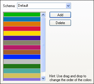
The Color Schema section of the Change Appearance dialog box provides four predefined color schemas (i.e., default, grayscale, colorful, and pastel) that can be customized; in addition you can also define your own color schema from scratch.

The top color will be used for the first series, then the second color and so on. You can change the order of the colors by selecting a color and dragging it to its new position with the mouse. To add a new or delete an unwanted color, click the corresponding button. In candlestick charts, only the first color will be used.
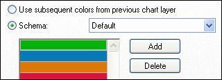
If you have appended one or several layers of overlay charts to a Charts window, the Color Schema section of the Change Appearance dialog box contains the additional radio button Use subsequent colors from previous chart layer which is activated by default.

When the radio button is activated, the color schema from the previous layer will be used and you cannot choose a separate color schema for the overlay. The series of the active layer will be displayed using subsequent colors from the color schema of the previous layer. This way, all series of the Charts window have different colors and can therefore be distinguished more easily.
You can break this link on any additional layer that you add and choose a different color schema that then can also be re-used in subsequent layers.
Color Range
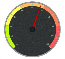
In gauge charts, you can customize the appearance of the gauge by applying colors to certain value ranges.

The definition shown in the screenshot above will appear in the gauge charts as follows:
 |  |