Styles
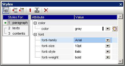
The Styles sidebar (screenshot below) enables CSS styles to be defined locally for SPS components selected in the Design View. This is as opposed to styles which are set globally in the Styles Repository sidebar.

The Styles sidebar is divided into two broad parts:
•The left-hand-side, Styles-For column, in which the selected component types are listed. You should note that when a selection is made in Design View, it could contain several components. The selected components are listed in the Styles-For column, organized by component type. One of these component types may be selected at a time for styling. If there is only one instance of the component type, then that one instance is selected for styling. If there are several instances of the component type, then all the selected instances can be styled together. The defined styles are applied locally to each instance. If you wish to style only one specific instance, then select that specific component instance in Design View and style it locally in the Styles sidebar. You can also select a component range by selecting the start-of-range and then the end-of-range component with the Shift-key pressed. For detailed information about the selection of component types, see Defining CSS Styles Locally.
•The right-hand-side, Style Definitions pane, in which CSS styles are defined for the component type/s selected in the Styles-For column. The Style Definitions pane can be displayed in three views (see below for description). For the details of how to set style definitions, see Setting CSS Style Values. The XPath icon  toggles on and off the application of XPath expressions as the source of style values. If a style property is selected and if the XPath icon is toggled on, then an XPath expression can be entered for this property and the return value of the XPath expression is used as the value of that style property. In this way, the value of a node in an XML document can be returned at runtime as the value of a property. When the XPath icon is toggled off, a static value can be entered as the value of the property.
Settings for Definitions-View
The view of definitions can be changed to suit your editing needs. Three view-settings (listed below) are available as buttons in the toolbar and as commands in context menus.
•List Non-Empty  : When this setting is toggled on, for the component type selected in the left-hand column, only those properties with values defined for them are displayed, in alphabetical order. Otherwise all properties are displayed. This setting is very useful if you wish to see what properties are defined for a particular component type. If you wish to define new properties for the selected component type, this setting must be toggled off so that you can access the required property.
•Expand All  : For the component type selected in the left-hand column, all the properties displayed in the right-hand pane are expanded. This setting can be combined with the List Non-Empty setting.
•Collapse All  : For the component type selected in the left-hand column of the window, all the properties displayed in the right-hand pane are collapsed. This setting can be combined with the List Non-Empty setting.
Toggle Important and Reset toolbar icons
Clicking the Toggle Important icon  sets the CSS value !important on or off for the selected CSS rule. Clicking the Reset icon
  resets the value of the selected property.