Using the Date-Picker
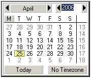
The Date Picker (screenshot below) is a graphical calendar in Authentic View for entering dates in the correct lexical format for nodes of xs:date and xs:dateTime datatype.

The lexical format is entered appropriately according to the datatype.
•For xs:date, the format of the entry is YYYY-MM-DD[±HH:MM], where the timezone component (prefixed by ±) is optional according to the XML Schema specification. A value for the timezone component can be selected in the Date Picker.
•For xs:dateTime, the format of the entry is YYYY-MM-DDTHH:MM:SS[±HH:MM]. The timezone component (prefixed by ±) is optional according to the XML Schema specification. A value for the timezone component can be selected by the user.
Inserting and deleting a Date Picker in the design
A Date Picker can be inserted in the SPS design: (i) for any node that is of datatype xs:date or xs:dateTime, and (ii) when that node is created either as contents or as an input field. A Date Picker can be inserted in one of two ways:
•By default when a node of datatype xs:date or xs:dateTime is created in the SPS. To set this default, toggle the Auto-Add Date Picker feature ON. Do this by selecting/de-selecting the command Authentic | Auto-add Date Picker. When the Auto-Addition of the Date Picker is switched on, the Date Picker is inserted when any element of datatype xs:date or xs:dateTime is created as either contents or an input field, or changed to either of these two components.
•By clicking the menu command Insert | Date Picker when the cursor is at the desired location within the xs:date or xs:dateTime node in the SPS. This command can be accessed via the Insert menu, or via the context menu when the cursor is within the xs:date or xs:dateTime node.
When the Date Picker is inserted, the Date Picker icon ![]() appears at that location. To delete a Date Picker, use the Delete or Backspace buttons.
appears at that location. To delete a Date Picker, use the Delete or Backspace buttons.
Using the Date Picker in Authentic View
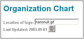
In Authentic View, the Date Picker appears as an icon (screenshot below).

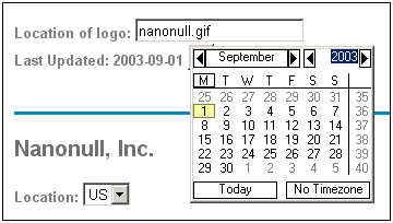
To modify the date, click the icon. This pops up the Date Picker (screenshot below). To enter a new date, select the required date in the Date Picker. The date will be entered in the correct lexical format according to that node's datatype.

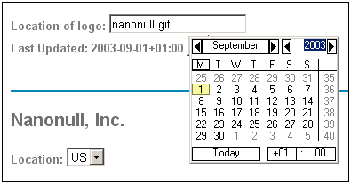
To enter a timezone, click the Timezone button, which is set to a default of No Timezone. The timezone will be entered in the lexical format appropriate to the node's datatype (screenshot below).
