Custom Buttons
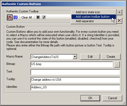
In the SPS design you can create a custom button to add to the Authentic toolbar and specify what macro it will trigger. To add a custom button to the Authentic toolbar, first select the command Authentic | Custom Toolbar Buttons, then click the Add button at the top right of the Authentic Custom Buttons dialog (see screenshot below) and select the type of custom button you want.
There are two types of custom buttons:
•Text State Icons are buttons that change the style of text (say, to bold or italic) and are associated with a particular element. Such elements would typically occur within elements of mixed-content type (that is, in elements that can contain both text and child elements). For example, a para element would be of mixed context because it can contain text, and, say, bold child elements, and italic child elements. In such a case, you can associate a Text State Icon (which is a bitmap image) to a child element of the mixed-content element. So, the bold element, for example, could be assigned a specific button image (its Text State Icon). A global template for the bold element is then defined to provide the bold formatting of the bold element. In Authentic View, the Text State Icon for the bold element will appear as a toolbar button. When the Authentic View user selects text within a para element of the example cited above and clicks the bold element's toolbar button, the selected text will be enclosed with the bold element tags and the bold formatting of the bold element's global template will be applied to the text.
•Custom toolbar buttons are associated with a particular macro.

Custom buttons take the following parameters:
•The location of an image for the button (in the Bitmap field) or text for the button (in the Text field).
•In the Element Name field (available for Text State Icons), enter the name of the element with which you wish to associate the Text State Icon,
•In the Macro Name combo box (available for Custom Toolbar Buttons), select the macro from the dropdown list that you wish to associate with the Custom Toolbar Button. The macros listed here are those that have been saved with the SPS. When you click the Create button, the Scripting Editor of StyleVision opens in its own window, enabling you to quickly and easily create a macro. Clicking the Edit button opens the selected macro for editing in the Scripting Editor.
•You can optionally enter a tooltip (in the Tooltip field) as a guide for the Authentic View user when he or she mouses over the custom button.
•In the Identifier field enter a text string that will be used as the identifier of the custom button. This identifier can then be used in scripting code if the designer wishes to control the button state via the AuthenticView API.
The screenshot above shows the the custom button US has the ChangeAddressToUS macro assigned to it. This custom button uses an image named US.bmp. Text for the button can be entered as a fallback. A tooltip has been entered and the custom button has the identifier Address_US. This example is from the file ToolbarButtons.sps is in the Authentic\Scripting folder of the Examples project in the Project window.