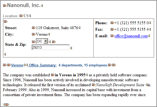
Authentic View Main Window
There are four viewing modes in Authentic View: Large Markup; Small Markup; Mixed Markup; and Hide All Markup. These modes enable you to view the document with varying levels of markup information. To switch between modes, use the commands in the Authentic menu or the icons in the toolbar (see the previous section, Authentic View toolbar icons).
Large markup
This shows the start and end tags of elements and attributes with the element/attribute names in the tags:

The element Name in the figure above is expanded, i.e. the start and end tags, as well as the content of the element, are shown. An element/attribute can be contracted by double-clicking either its start or end tag. To expand the contracted element/attribute, double-click the contracted tag.
In large markup, attributes are recognized by the equals-to symbol in the start and end tags of the attribute:
Small markup
This shows the start and end tags of elements/attributes without names:

Notice that start tags have a symbol inside them while end tags are empty. Also, element tags have an angular-brackets symbol while attribute tags have an equals sign as their symbol (see screenshot below).
To collapse or expand an element/attribute, double-click the appropriate tag. The example below shows a collapsed element (highlighted in blue). Notice the shape of the tag of the collapsed element and that of the start tag of the expanded element to its left.
Mixed markup
Mixed markup shows a customized level of markup. The person who has designed the StyleVision Power Stylesheet can specify either large markup, small markup, or no markup for individual elements/attributes in the document. The Authentic View user sees this customized markup in mixed markup viewing mode.
Hide all markup
All XML markup is hidden. Since the formatting seen in Authentic View is the formatting of the printed document, this viewing mode is a WYSIWYG view of the document.
Content display
In Authentic View, content is displayed in two ways:
•Plain text. You type in the text, and this text becomes the content of the element or the value of the attribute.

•Data-entry devices. The display contains either an input field (text box), a multiline input field, combo box, check box, or radio button. In the case of input fields and multiline input fields, the text you enter in the field becomes the XML content of the element or the value of the attribute.
In the case of the other data-entry devices, your selection produces a corresponding XML value, which is specified in the StyleVision Power Stylesheet. Thus, in a combo box, a selection of, say, "approved" (which would be available in the dropdown list of the combo box) could map to an XML value of "1", or to "approved", or anything else; while "not approved" could map to "0", or "not approved", or anything else.
Optional nodes
When an element or attribute is optional (according to the referenced schema), a prompt of type add [element/attribute] is displayed:
Clicking the prompt adds the element, and places the cursor for data entry. If there are multiple optional nodes, the prompt add... is displayed. Clicking the prompt displays a menu of the optional nodes.