Images, Icons, and Tool Buttons in Mobile Apps
We have written previously about Integrating APIs and Mobile Apps to create a rich and entertaining user experience. Since publishing our previous post, we continued to enhance the GPS demo app with additional API support to get current weather conditions and scheduled events nearby.
One challenge with offering all this functionality on a small mobile screen is to provide users with a clear, consistent, and easy to use navigation scheme across all views in the app.
Applying icon images as tool buttons in mobile apps can create a stylish and graceful navigation menu, especially if the icons are chosen based on recognizable and commonly-agreed conventions. For instance, an arrow pointing left often indicates go back, and a floppy disk icon frequently represents save data, even when the ultimate destination might not be a new file nor a disk.
In this post we will describe how to use image icons to build cross-platform navigation menus with tool buttons in mobile apps using MobileTogether.
The screenshots below show the Where Am I app running on Apple iOS and Android phones.
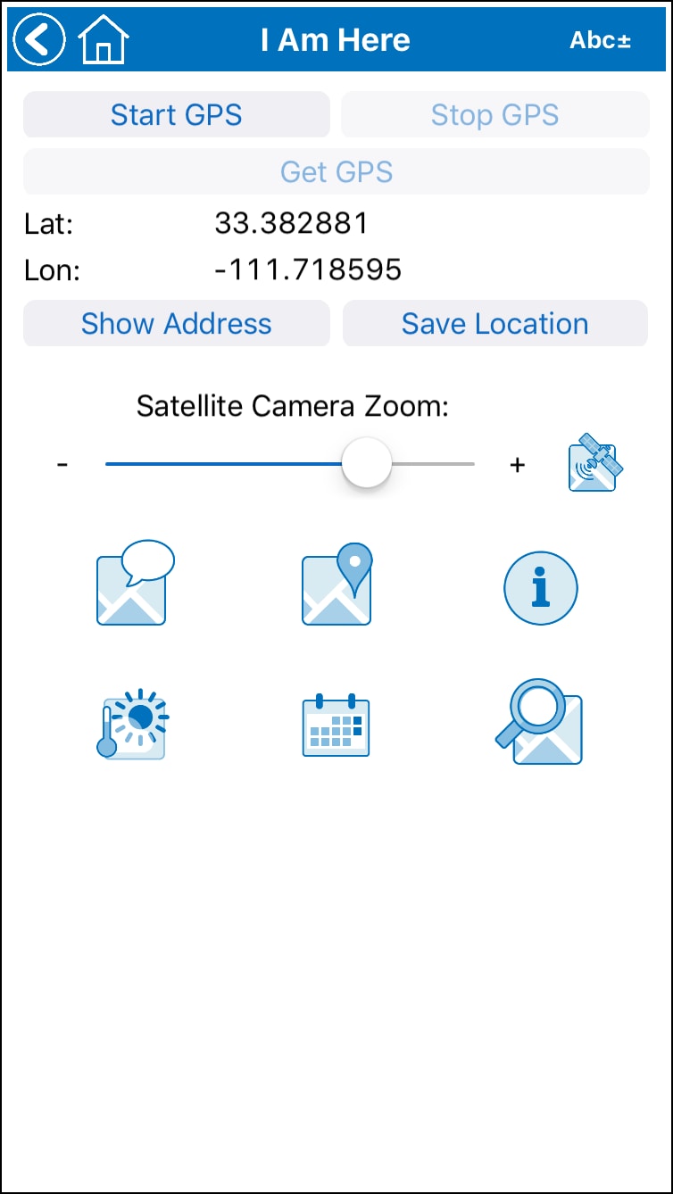
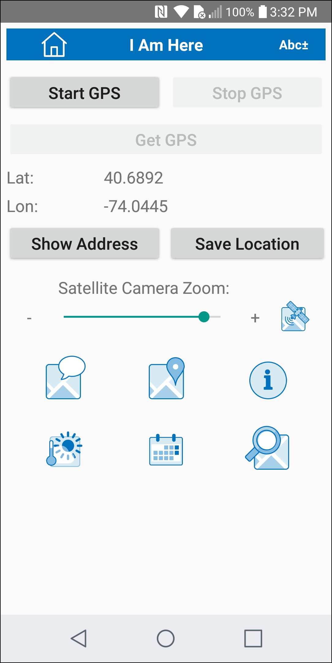
In each view, the user has just acquired the current GPS coordinates and is presented with the same series of options represented by tool buttons:
- View a satellite photo of the location, based on the selected zoom level
- Send a text message containing the current location
- Open the default map application at the current location
- Perform a general Web search based on the current location
- Get the current weather conditions at the location
- See a list of upcoming events nearby
- Search the surrounding area using the MapQuest Search API
The tool buttons are defined and poisoned in the app using the MobileTogether Designer, the visual app development tool that lets developers preview the app layout and test complex execution logic at any time during development.
Our navigation menu is constructed as a series of tables, illustrated here as seen in the MobileTogether Designer Page Design window:
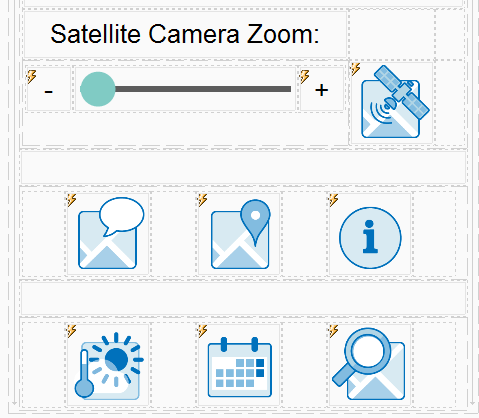
There are several issues to consider when creating a menu with tool icons, especially to create a predictable and consistent user experience across a range of mobile devices with different screen sizes and pixel dimensions.
First, it’s important that each image effectively imply the function to be performed when it is clicked.
Second, the images must be large enough to fit users with various size fingers. We often hear mobile users excuse accidental clicks due to “my clumsy fingers.” But was the user clumsy, or is the app layout too tiny and confusing to navigate?
Lastly, for apps that display multiple screens with various tool buttons, consistent layouts and functionality across pages makes the app much more intuitive to use.
Our Where Am I demo app strategically combines the functionality of two Control Properties to manage the size and layout of tool icons.
![]()
Setting the Control Width for each icon to “fill_parent” lets us use one image file for all screen sizes. In our app, each icon is a 192x192 pixel .png image file, and fill_parent will automatically resize the image to fill the column width on every end-user mobile device.
The table column widths for each tool icon are defined in XPath expressions. We used an element in the Persistent data tree to specify column width for tool icons. This let us experiment with different sizes on various devices by redefining the value in the data tree instead of editing every column width property for each test. Overall, we used three different icon sized in the app. Here is the portion of the data tree where the column widths are stored:
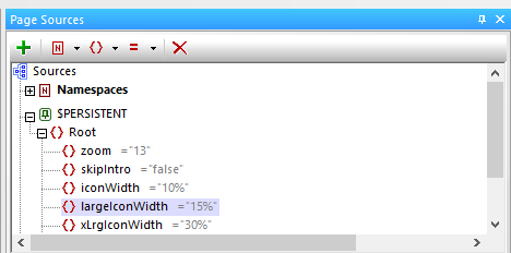
The table also includes blank columns to create margins around each tool icon. The column widths for the margins are left blank, which means all remaining unassigned space is divided evenly between them. We added a space control between the rows of icons to create the vertical margin between rows.
You can also choose to embed the tool icon image file in the app file, or upload the images to the MobileTogether server separately.
Defining Actions for Tool Buttons in Mobile Apps
Defining the actions to be performed when the tool icon is clicked is easy. MobileTogether allows any control to be clickable, just like a button control. Control actions are defined via the right-click context menu:
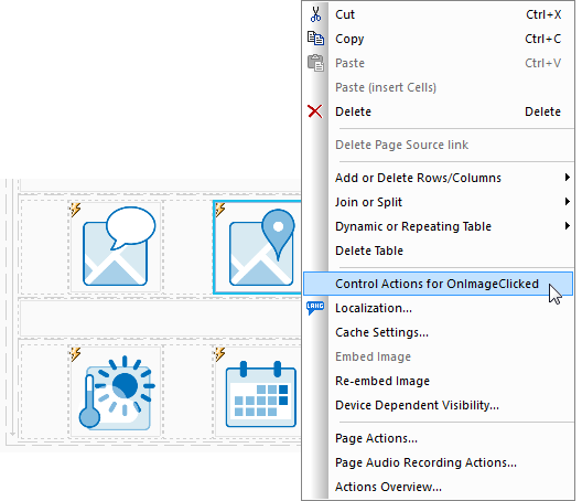
The button selected above is intended to open the default map application on the mobile device, centered on the GPS coordinates. However, the action script is enhanced with separate definitions for a tap, or a normal click, and a long click.
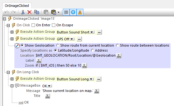
Based on a user preference, either click might play a button sound from the built-in MobileTogether sound library. A normal click then opens the map, but a long click simply opens a message box explaining the button action.
Varying Sizes for Tool Buttons in Mobile Apps
We needed smaller tool buttons for situations where the tool button shares space with text or other controls on the page, for instance the search page and search results pages shown here:
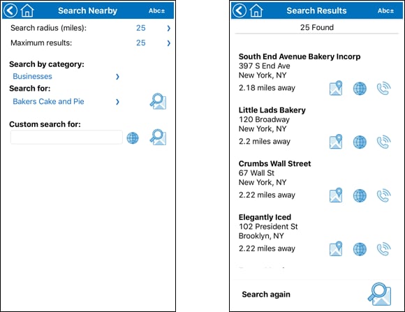
The tool icons on these pages were defined in columns using the smaller icon width element in the Persistent data tree.
Learn More and Try it Yourself
If you missed our earlier post on integrating APIs into mobile apps, you can read it here. Or, if you’re new to MobileTogether, check out the MobileTogether Demos page with links to videos, tutorials, and more demo apps.
You can examine our demo app more closely to see exactly how we implemented tool buttons in mobile apps, or to review the APIs for mapping, search, weather, and events. Just download the free to use MobileTogether Designer, and get a copy of our app at GitHub in this repository: https://github.com/altova/MobileTogether-more-examples/tree/master/Where%20Am%20I