Tag Archive for: v2011

Using Charts to Effectively Communicate Data


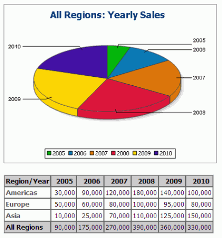
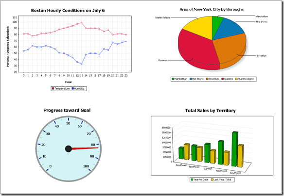
Altova first added support for charts and reporting the Altova MissionKit with the launch of Version 2011 last September. The v2011 reporting functionality includes options for line charts, 2D and 3D bar charts, 2D and 3D pie charts, round gauge and bar gauge charts. Here are a few examples: Charts created with the Altova MissionKit v2011
Advanced chart features in v2011r2

Version 2011 Release 2 of the Altova MissionKit, introduced on February 16, adds an exciting group of enhancements to the chart and reporting features in XMLSpy, StyleVision, and DatabaseSpy. The chart design options and user interface work the same way in all three applications, so MissionKit users can work intuitively and productively as they move from processing XML data in XMLSpy, to preparing charts for a business intelligence report with StyleVision, and even when they create graphical displays directly from SQL query results in DatabaseSpy. The wide range of new customizable charting features introduced in version 2011 release 2 includes:

  • Stacked Bar charts
  • Area charts
  • Stacked Area charts
  • Candlestick charts
  • Chart overlays
  • Background images and color gradients
  • Ability to change position of axis labels
  • And more!

Now you can create attractive and informative charts to represent a wide variety of data sets without exporting data to a dedicated charting application. Charts created using the Altova MissionKit are not limited to any specific presentation technology – for instance you can use StyleVision to include charts in HTML, Microsoft Word, RTF, or PDF documents, or you can save charts created in DatabaseSpy in a variety of image formats at the custom resolution you specify. In this post we will show some examples of the new charts and features available in all three MissionKit reporting and charting applications – XMLSpy, StyleVision, and DatabaseSpy.

Stacked bar charts

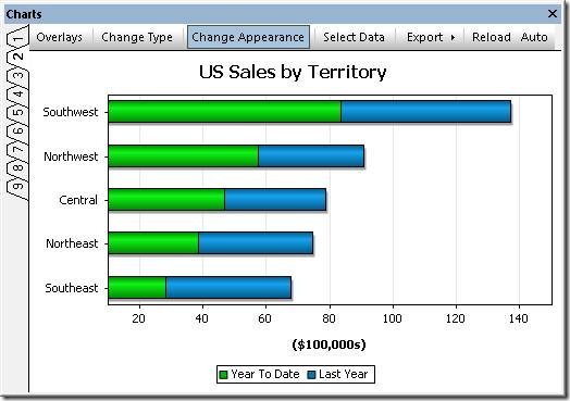
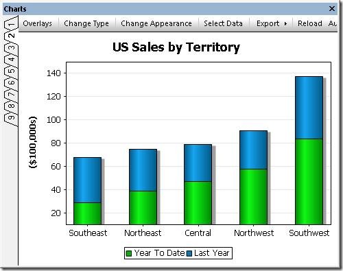
Stacked bar charts are a variation on bar chart presentation and are especially useful when multiple ranges of data need to be illustrated. Stacked bar charts are also useful to more clearly illustrate data in a smaller area. The image below shows a stacked bar chart to illustrate the performance of a sales team by region over two years Stacked bar chart Note that the combined height of each stack in the Stacked Bar Chart represents the total sales over the two-year period for each Territory, since the sales for Last Year are added above the Year To Date numbers. Stacked bar charts complement regular bar charts and 3-D bar charts to offer users the greatest flexibility in illustrating SQL query results. If the user prefers horizontal bars, a checkbox labeled Draw X and Y exchanged in the Change Appearance tab selects that orientation. Chart orientation option Horiztonal stacked bar chart This orientation option is also available for other 2-D bar charts, line charts, area charts, and candlestick charts.
Area charts

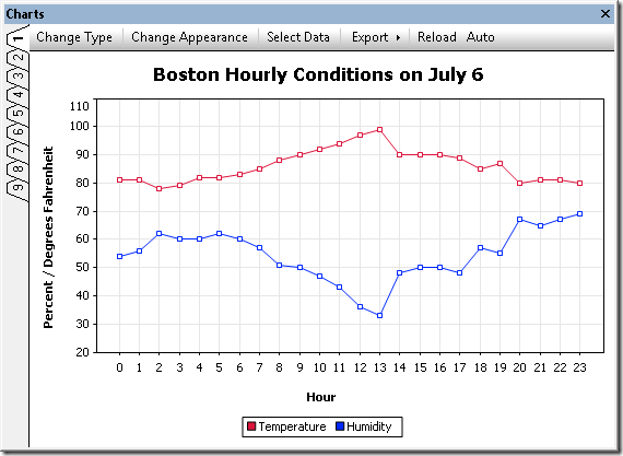
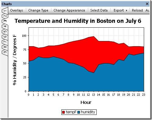
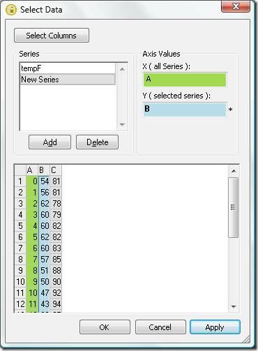
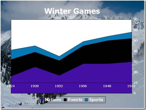
Area charts are similar to line charts, with shading applied to make a more graphically appealing display. The area chart below shows a record of temperature and humidity changes by hour over the course of one day. Creative application of color can emphasize the point! Area chart To successfully build an area chart, the analyst must consider the values in each data category. As the area chart is constructed, each category forms an opaque layer on top of the layers for data retrieved previously. In the case illustrated above, Temperature was always a larger number than Humidity, so a SQL query was constructed in DatabaseSpy to retrieve the Temperature value before Humidity to prevent Temperature from acting like a curtain to hide the Humidity data. However, if the data columns appear in a sequence with values in increasing order, the last layer would overlap and hide all the preceding layers. In that case, the chart tab heading titled Select Data lets the user add and delete columns from the results to re-sequence the data correctly. The Select Data column also lets the user edit the names assigned to each column on the X-axis label. Select Data dialog As alternative solution, the Transparency option in the Change Appearance tab lets the user adjust color levels to allow hidden layers to show through.
Transparency dialog

Stacked area charts

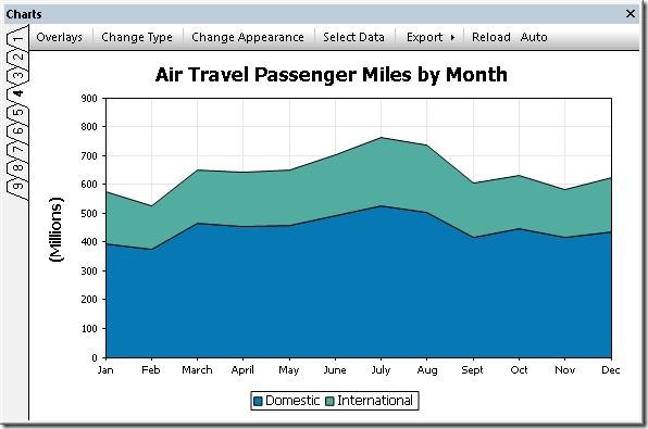
As implied by their name, Stacked Area charts layer the columns of a data set to illustrate the overall sum of a data series. Stacked Area charts also eliminate the potential overlapping data problem that can occur with regular area charts. The chart below shows a table of air passenger revenue miles traveled by month, with individual regions for domestic and international travel. Stacked area chart The Stacked Area chart creates a graphical representation of the total of Domestic and International miles, even though the total miles value was not part of the provided data. This is apparent at the top of the January entry, where the International region intersects the Y axis just below 600 (the original data showed 392 million Domestic miles and 181 million International miles, for a total of 573). A strategic data analyst will always consider the nature of the data to be reported when choosing any particular chart type. For instance in the weather example we used above, adding temperature and humidity values in a stacked bar chart would not be logical!
Candlestick charts

Candlestick charts were originally developed by a wealthy Japanese businessman who began trading at the local rice exchange around the year 1750. He kept records of the local market psychology, learning to boost his profits by carefully monitoring prices and not rushing into trades. Today, charts are used to represent financial data such as stock prices over a period of time. Every day the market is open, each stock has four relevant data points that can be rendered in a candlestick chart: the price at market opening, the price when the market closed, the high price during the day, and the low price during the day. Investors and financial analysts like to view these indicators to gauge the stock’s performance over a period of time. In the candlestick chart below, each solid bar represents the range between the opening and closing price and the thin vertical line through each bar shows the extent of the high and low prices for the day. Candlestick chart In this version of the chart, following common convention, the color of each bar signals whether the stock was up or down for the day. If the bar is green, the stock was up for the day– it opened at the price indicated by the bottom of the bar and closed at the price indicated by the top. If the stock was down for the day, the bar is red and the symbolism is reversed – the stock opened at the price indicated at the top of the bar and closed at the price shown by the bottom. Numerous options are available to set line and fill colors, the Y-axis range and values, and more. Because they were intended to be printed in black and white, the original candlestick charts used empty bars to indicate the price increased and solid bars to indicate price decreases. The Altova MissionKit offers this option: Candlestick chart in black and white Another candlestick chart variation omits the opening price and simply illustrates the range by a vertical line and the closing price by a horizontal line. This option is automatically supported when a data set only includes the high, low, and closing prices. Candlestick chart without opening price
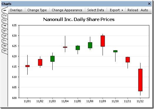
Chart overlays

The Overlays feature lets you combine multiple charts in a single image. Each overlay chart has unique settings and can even be generated from a separate data file. The image below shows a candlestick chart of a stock’s daily prices with the daily sales volume in a bar chart overlay. Candlestick chart with bar chart overlay

Support for background images & color gradients

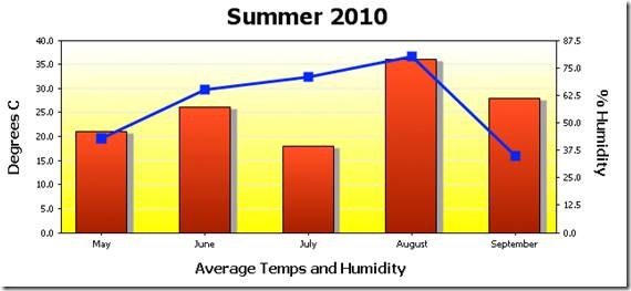
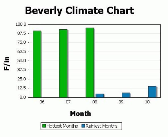
The ability to specify background color gradients and background images gives you even more flexibility for creating customized, eye-catching charts. Overlaying one chart on another lets you visualize multiple data sets with different Y-axes and types. Area chart with a background image The Change Appearance dialog lets users select a background image, as in the Winter Games chart above, or apply a background color gradient, as in the Summer 2010 chart below. Change Appearance dialog Bar chart with a line chart overlay and background color gradient If you’d like to see for yourself how easy it is to use Altova tools to create attractive charts from XML and database data, download a free trial of the Altova MissionKit.
Tags: , , , , , , ,

New Feature : Authentic® Scripting in StyleVision®


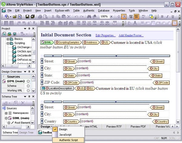
StyleVision has really benefited from some very cool new features in our past and current releases – absolute positioning, editable variables in eForms, global templates, and of course, charting, bring power and flexibility to your report generation and electronic forms designs. Now with our 2011 release, the addition of an integrated scripting environment expands on these features, giving you the ability to create robust data entry applications for Authentic users. Scripting functionality is embedded directly into the StyleVision design (SPS) so that Authentic end-users only need to open an eForm to start updating XML and database sources. Event handler and macro components can be written using supported scripting languages, JavaScript or VBScript, and you can also design input forms graphically using drag and drop functionality. To embed scripting functionality in a StyleVision design (SPS), open the Scripting Editor window via the Authentic | Edit Authentic Scripts menu command or by choosing Authentic Script from the Design tab context menu. stylevision_script The Scripting Editor provides an interface through which you can create any of the following four main components:

  • Global declarations – scripts that contain variables and functions that can be used by forms, event handlers, and macros.
  • Macros – scripts that are used to assign user-defined actions to design elements, toolbar buttons or context menu items.
  • Event handlers – scripts that can be associated with a variety of available events (OnSave, OnValidate, etc.) for user interface elements in an Authentic form. The return value from the script typically instructs the application how to continue its processing.
  • Forms – simple graphical components made up of text input fields, buttons, and so on. Forms are used to show dialogs or request additional user input within scripts that are used as event handlers and macros.

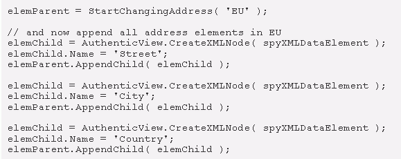
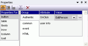
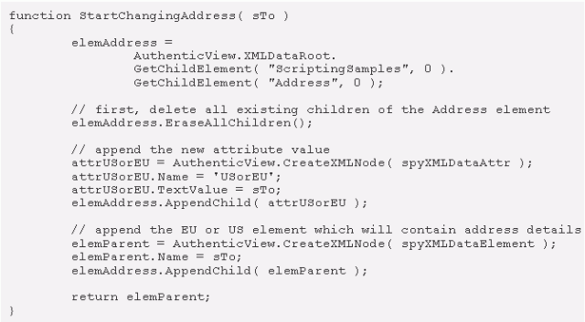
Global Declarations The GlobalDeclarations component is presented by default in every scripting project. Variables and functions are added using code fragments written in the scripting language (JScript or VBScript) associated with your project. An example function, StartChangingAddress, appears below: script1 Variables or functions created in the global declarations script are accessible to all forms, event handlers, and macros in your scripting project. Macros Macros let you create functions that are called from other scripts or event handlers. For example, the macro shown below uses the GlobalDeclarations, including the StartChangingAddress function, to create a form for adding information to an active XML document. script2 Macros can be specified and associated with StyleVision design elements using the Authentic group in the Properties window. Object events that are supported for macros are:

  • OnBeforeChange
  • OnAfterChange
  • OnBeforeLinkClick
  • OnClick
  • OnSetFocus
  • OnKillFocus

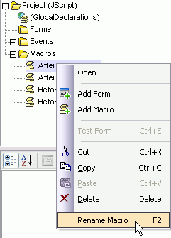
clip_image003 Macros are controlled in the right-click menu of the scripting project tree, where you can add or rename. clip_image004 Event Handlers Event handlers can also be defined by selecting the Events icon in the toolbar of the Properties and Events pane. Here, you can define the behavior that the application should exhibit once a specific action is initiated or completed. Events that can be controlled include mouse movement and clicks, drag and drop, key presses, and more. Authentic View event scripts added in Version 2011 include:

  • On_AuthenticLoad – allows Authentic to set up features before the user starts working with the file
  • On_AuthenticBeforeSave – lets you prevent saving if, for example, entered data is not complete
  • On_AuthenticToolbarButtonClicked – allows behavior to be extended/modified on toolbar click
  • On_AuthenticUserAddedXMLNode – lets Authentic load any child nodes or textual content to the newly added XML node, if necessary, so that the form is prefilled with data

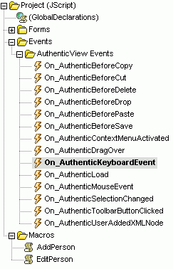
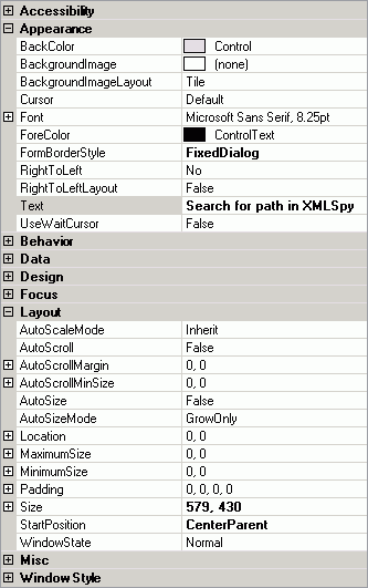
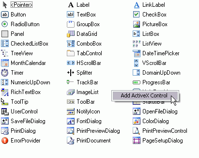
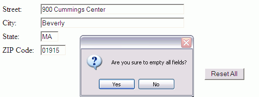
The scripting editor provides a folder which contains the full set of events for which event handler scripts can be written. clip_image005 Forms The Authentic Scripting Editor lets you graphically build forms using a palette of objects such as text input fields, buttons, labels, and more. General form properties such as size, background color, font styles, etc. are defined in the Properties pane. clip_image006 The form object palette provides all of the objects that are available. Registered ActiveX controls can also be added by selecting the Add ActiveX Control command in the right-click menu. clip_image007 Once an object has been inserted in your design, you can specify its appearance properties – such as alignment, borders, scroll bars, etc. – in the Properties pane.

Scripting in Practice

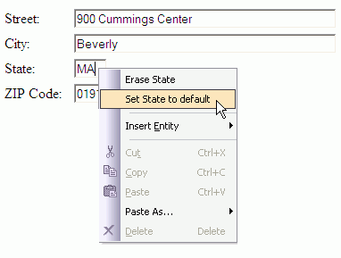
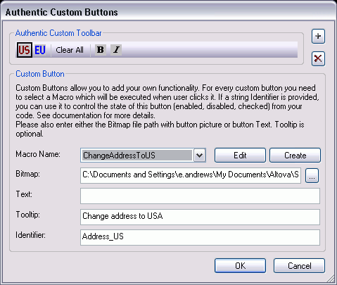
Authentic View scripting gives StyleVision designers complete and flexible control over various aspects of the user interface. In addition, extensions to the existing COM APIs add more flexibility for scripting and interactive eForm design. For example: Interactive object-specific design elements – such as the click of a button, modification of form elements, focus change between fields, etc. – can be accessed through the Authentic interface. User actions include OnClick, OnBeforeLinkClick, OnBeforeChange, OnAfterChange, OnSetFocus, and OnKillFocus. clip_image008 Entry helper windows can be suppressed to ensure that Authentic end-user access is limited only to modification of the intended elements, attributes, and entities. Context (right-click) menus can be completely customized by removing existing or adding new commands. clip_image009 New toolbar buttons can be created and associated with macros, giving the designer the ability to add completely new commands to the toolbar. clip_image010 Custom and standard toolbars can be modified by disabling any buttons that the end-user should not have access to. clip_image011 The COM API has also been extended with new interfaces and additional methods and properties including:

  • AuthenticView (i.e. CreateXMLNode, EvaluateXPath, GetToolbarButtonState)
  • AuthenticRange (i.e. IsSelected, GetVariableValue)
  • XMLData (i.e. GetChildElement, InsertChildAfter)
  • AuthenticEventContext (i.e. GetXMLNode, SetVariableValue)
  • AuthenticContextMenu (i.e. CountItems, DeleteItem, GetItemText)

Check out all of this new functionality and more – download a free 30-day trial of StyleVision today!

Tags: , , ,

New Software Feature: Charting in DatabaseSpy 2011


Multi-database query, design, and database comparison tool. A colorful, eye-catching chart is much more vivid and communicates meaning more quickly than a table of numeric data. As part of the v2011 launch of the Altova Missionkit on September 8, 2010, DatabaseSpy 2011 includes a new SQL charts tool that provides a wide variety of charting features to graphically represent SQL query results. DatabaseSpy 2011 supports the following chart types to provide the most appropriate representation of various data sets:

  • Line charts
  • 2-D and 3-D pie charts
  • 2-D and 3-D bar charts
  • Round gauge and bar gauge charts

A line chart generated from SQL query results by Altova DatabaseSpy DatabaseSpy SQL Charts Tool Supported Databases DatabaseSpy 2011 supports multiple database types and can generate charts from the results of SQL queries to the following databases:

  • Microsoft® SQL Server® 2000, 2005, 2008
  • IBM DB2® 8, 9
  • IBM DB2 for iSeries® v5.4, 6.1
  • Oracle® 9i, 10g, 11g
  • Sybase® 12
  • MySQL® 4, 5
  • PostgreSQL 8
  • Microsoft Access™ 2003, 2007

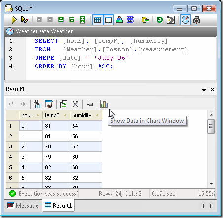
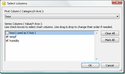
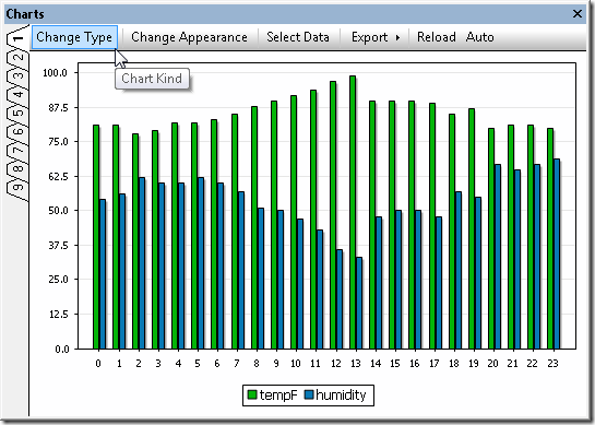
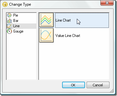
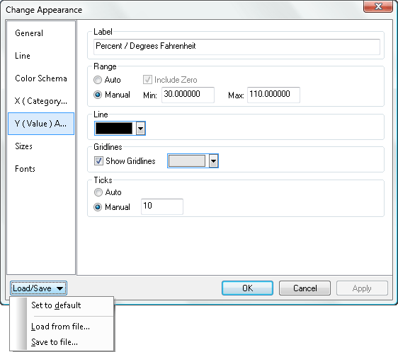
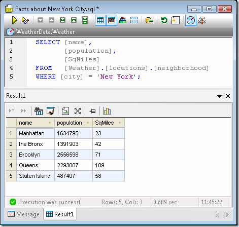
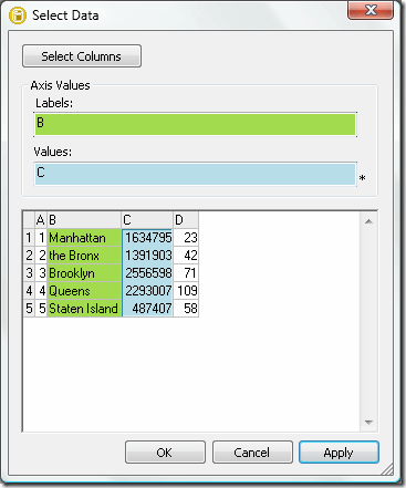
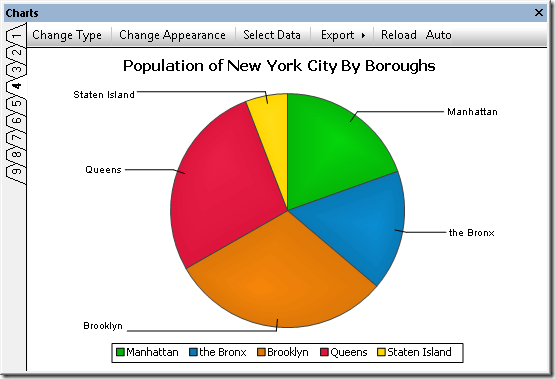
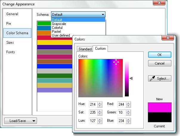
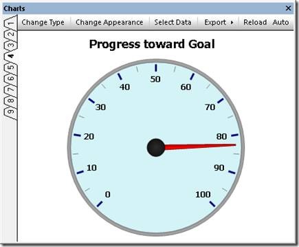
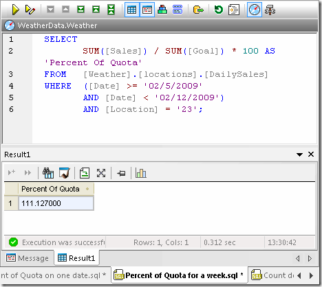
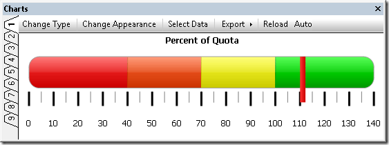
Charting SQL Query Results A link in the Altova DatabaseSpy 2011 SQL Editor Results window toolbar opens the Chart Selection dialog to initiate data charting. A SQL query and result table in Altova DatabaseSpy The chart tool icon opens the Select columns dialog, where users can specify which column of the Results table to use for the X-axis. Users can also change the order of value columns, or even leave one or more results column uncharted. This feature permits multiple charts to be generated for subsets of data from a single query that retrieves many table columns. DatabaseSpy SQL Chart Tool Select Columns dialog The data is initially plotted using the default chart type and settings in a new Charts window. Like other DatabaseSpy helper windows, the Charts window can be unpinned, moved, and resized, as a floating window. The Charts window has nine tabs that permit users to specify properties of nine different charts that can even be assigned to different query results. A bar chart generated from SQL query results by Altova DatabaseSpy The Change Type dialog gives users instant access to a wide variety of other chart styles. DatabaseSpy SQL Chart Tool Change Type dialog Within each chart type, sub-menus specify all the details of the chart appearance. Numerous customization options are available for each chart type, including chart titles, foreground and background colors, definition of axis ranges and labels, control of fonts, text colors and sizes, and more. A pull-down menu also lets users save and reload customized chart settings in files, for instance to store standardized chart styles and reuse them with multiple query results. The screenshot below shows a few of the settings for the line chart at the top of this page, which illustrates the same temperature and humidity data shown in the SQL query screenshot. DatabaseSpy SQL Chart Tool Chart Appearance dialog The screenshot below shows a bar chart reporting total sales for the year to date by sales territory. This is a typical example of a chart style that can be reused in a report that is frequently updated with the latest sales data. A 3-D bar chart generated from SQL query results by Altova DatabaseSpy Multiple Charts from a Single SQL Query Results Table Generating multiple charts from the same SQL query is simple and straightforward by selecting different columns of data in the Results table. The SQL query in the screenshot below returns the population and land area of the boroughs that make up New York City: A SQL query and result table in Altova DatabaseSpy Users can choose any tab in the Charts window, then assign data by clicking the Select Data menu option in the Charts window menu bar. DatabaseSpy SQL Chart Tool Select Data dialog Here are examples of an ordinary pie chart and a 3-D pie chart generated individually from the population and square miles data columns of the Results table: A 2-D pie chart generated from SQL query results by Altova DatabaseSpy A 3-D pie chart generated from SQL query results by Altova DatabaseSpy DatabaseSpy 2011 lets users change the chart colors by selecting an alternate palette or any custom colors. Customization of chart colors in Altova DatabaseSpy Gauge Charts from a Single Value or Calculated Results Gauge charts are used to illustrate a single value and show its relation to a minimum and a maximum value. For a round gauge chart, users can specify the beginning and ending values of the range, and the starting and ending locations on the gauge. DatabaseSpy 2011 enables complete gauge customization through selection of the background color, border color, needle color, text font, size, and color, and more. A round gauge chart generated by Altova DatabaseSpy DatabaseSpy 2011 can generate charts from results tables that contain relational data, or from results of calculations performed by SQL queries. Gauge charts are a good fit for illustrating a single calculated value. The screenshot below shows a percent of quota calculation in a DatabaseSpy 2011 SQL Editor window, based on a table of stored daily sales and sales quota data. SQL query that generates a single calculated result in Altova DatabaseSpy The calculated value can be more dramatic when represented in a bar gauge chart, where DatabaseSpy 2011 permits multiple background colors defined by ranges along the axis, as shown below. clip_image018 Export Charts for Reports DatabaseSpy 2011 exports charts to image files in .png, .bmp, .gif, or .jpg files in customized sizes, independent of the size of the chart window on the screen to create eye-catching visual elements in reports of all types. Export option in the DatabaseSpy Charts menu Whether you are a developer, business analyst, research professional, or other database user, DatabaseSpy 2011 can generate elegant charts from SQL query results to illustrate your data reports – download a free 30-day trial today!
If you’d like to find out for yourself how well DatabaseSpy works with other Altova tools, download a free trial of the Altova MissionKit.
Tags: , , ,

New Software Release : MapForce 2011


  clip_image002 On September 8, Altova released v2011 of the MissionKit with powerful new features across the entire product line. MapForce has benefitted from the addition of advanced data integration functionality like chained transformations, integration with StyleVision for rendering transformation output, new formatting functions, and extended support for the UN/EDIFACT and ANSI X12 EDI formats. Let’s take a closer look at the exciting new features in MapForce 2011 including:

  • Chained transformations
  • Integration with StyleVision for output components
  • Formatting of numbers, dates, and times
  • Extended support for EDIFACT
  • Extended support for X12

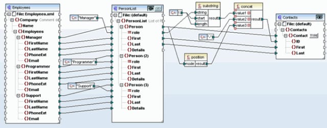
Chained transformations Support for chained transformations lets you create complex mappings where the output of one mapping becomes the input of another. This is a powerful feature that adds to MapForce’s ability to execute fully automated transformations. Each chained component becomes a modular entity in an interdependent transformation sequence, allowing for conversions to be made on-the-fly. You can create chained transformations using any number of mapping components connected to a final target component. Preview and code generation features can be displayed/generated for intermediate components, as well as for the final mapping result. Intermediate mapping components also now have a "pass-through" button in the title bar that lets you define the set of data that gets passed on to the following component.  
clip_image003

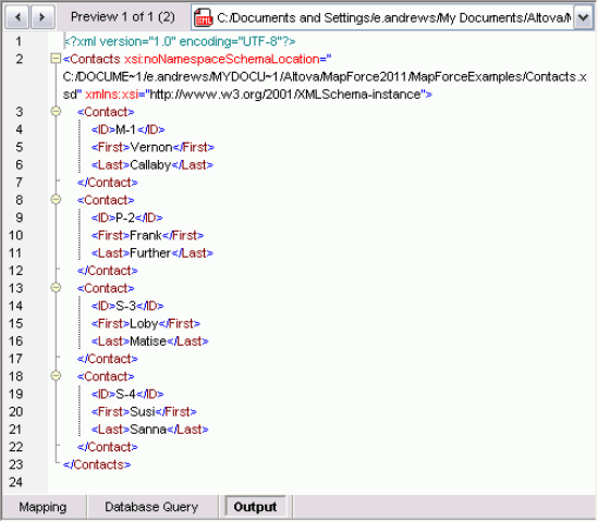
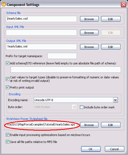
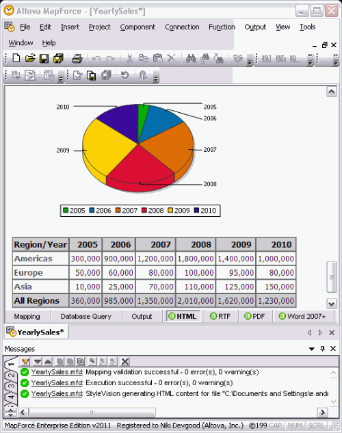
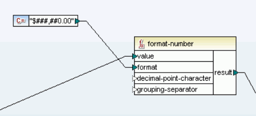
For example, the mapping above shows a chained mapping where the pass-through button is active and sample data is assigned to component A. The output preview offers two separate sets of data: XML that conforms to the Contacts.xsd schema and incorporates a subset of data mapped from the Employees.xml sample file, and XML that conforms to PersonList.xsd using data from the Employees sample file. In both cases, the data has been amended with the relevant constants and functions that are shown in the MapForce design pane.   clip_image004 Integration with StyleVision for output components Support for Global Resources throughout the MissionKit has already offered you some integration between Altova software applications… But this feature takes that integration to a whole new level, allowing you to render XML and XBRL output from your data mappings into HTML, RTF, PDF, and Word 2007+ using an associated StyleVision template design. This essentially combines MapForce’s any-to-any data mapping capabilities with a sophisticated rendering engine, meaning that you can now automate report generation from virtually any data format that can be mapped to an XML Schema or XBRL taxonomy. In the example below, a StyleVision design has been associated with the mapping by simply right-clicking the output file and browsing to select a suitable SPS file using the Component Settings dialog.   clip_image005   Once the SPS file is entered or selected, you will be able to simply click on the relevant format tab (i.e., HTML, RTF, PDF, or Word 2007+) to view rendered data.   mapforce-html Formatting of numbers, dates, and times Probably one of the most requested features, this lets you easily convert numbers, dates, and times to their string representations using several different formatting functions. For example, the simple format-number function below converts a numerical input (e.g., 12345) to a monetary one in with a USD prefix, comma separating the thousands digits, and two decimal places (e.g., $12,345.00).   format-number   This post really just scrapes the surface of what the new MapForce release has to offer -download a free 30-day trial of Mapforce today to experience all of these new features and more!

Tags: , , , , , ,

New Software Release : StyleVision 2011


On September 8, Altova released v2011 of the MissionKit with the addition of powerful reporting functionality across many of the products. Specifically, StyleVision has been supercharged with a multitude of new features, securing its place as an advanced and versatile business intelligence application, priced for today’s market. Let’s take a closer look at the exciting new features in StyleVision 2011 including:

  • Charts as a new design element
  • Chart wizard for XBRL files
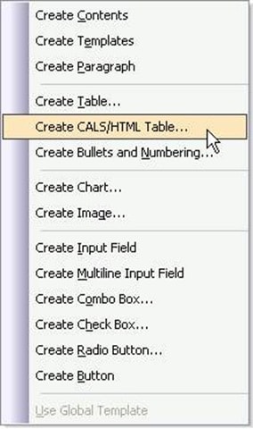
  • Explicit support for HTML/CALS tables
  • Ability to import existing XSLT files
  • Scripting & toolbar editor for Authentic®

Charts as a new design element StyleVision joins other MissionKit 2011 tools with support for charting, adding to its already advanced general purpose reporting capabilities to create a highly scalable decision support tool for XML, database, and XBRL content. As with all StyleVision designs, charts can be easily rendered for multi-channel output in HTML, RTF, PDF, Word 2007+, and electronic forms. The following types of charts are available:

  • 2D & 3D pie charts
  • 2D & 3D bar charts
  • Category line graphs
  • Value line graphs
  • Gauge charts

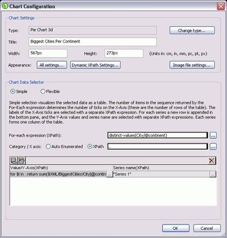
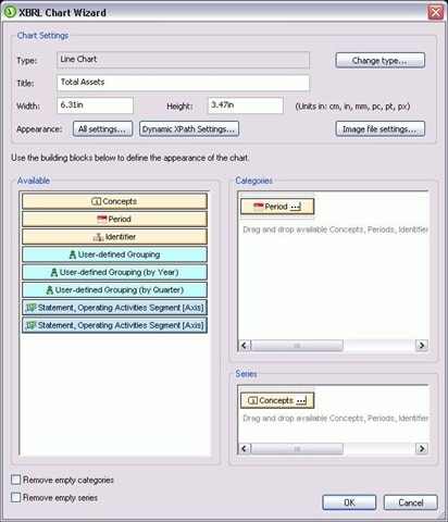
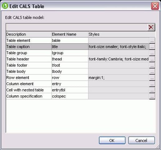
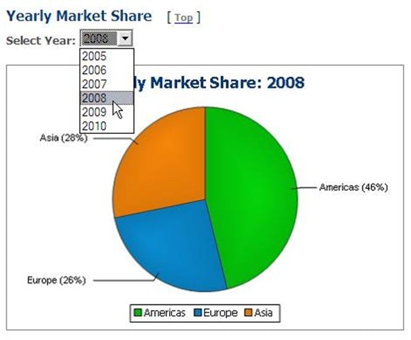
The chart configuration dialog lets you use XPath to select data for your charts. This can be as simple or as complex as you want, running the gamut from database data that is already laid out in a tabular format to XML files where the nodes you need to select are spread out over hundreds of lines of code. Pssst… if you’re thinking that this would be great for the unique demands of XBRL, read on because we created something special with that in mind ;). Here are a couple of examples of charts that you can build in StyleVision: clip_image001 clip_image003 Yup, you can even chart completely different sets of data on the same graph. How creative you want to get with your visual analysis reports is really up to you. You can even create interactive charts for use with Authentic – allowing end users to manipulate eForms to view the desired result. For example, the screenshot below shows the Authentic view of a pie chart where a drop-down menu (combo box) selection dictates the subset of data that is represented. clip_image005 Charts are easily integrated into your StyleVision report templates at any point by simply dragging the relevant node onto the design pane and choosing Insert Chart from the context menu. The Chart Configuration dialog can then be used for chart settings (choosing chart type and style) and data selection (populating your chart axes with the relevant data from the source). clip_image007 You can even use Dynamic XPath Settings to apply transactional data to your chart. Of course, if you sometimes have trouble telling your .s from your /s, you can always get some help with more complex expressions from StyleVision’s XPath Builder. Chart wizard for XBRL files If you are familiar with XBRL, you are intimately aware of the complexities associated with navigating XBRL taxonomies. And, if you’re impressed with what you’ve just read about StyleVision’s charting capabilities, you are probably trying to remember where you put that old XPath reference guide. Not to worry! StyleVision has added to its XBRL rendering support with an XBRL Chart Wizard that lets you easily select data and define presentation settings for your XBRL reports. clip_image009 Concept and Period Properties dialogs are included to let you specify which elements should be included and how periods (instants or intervals of time) should be handled in your chart. Explicit support for HTML/CALS tables StyleVision now provides direct support for HTML/CALS tables, meaning that it will automatically recognize values dictating table structure (column number, row height, etc.) and apply them to rendered output. (v2011 adds support for rendering HTML/CALS tables in HTML, RTF, PDF, AND Word 2007+ – previous releases have supported output to Authentic eForms.) clip_image011 You can also easily assign additional presentation styles to HTML/CALS tables using the Edit CALS/HTML dialog. clip_image013 Ability to import existing XSLT files Well, I’m sure a few of you were hoping that this one was coming soon… You can now base your StyleVision template designs on existing XSLT files that were designed for HTML output or XSLT files with XSL:FO commands that were designed for output to PDF. Simply choose the New from XSLT File option and presto change-o, your design will be fully manifested in the design pane. Now you can edit your template using StyleVision’s graphical interface and output to even more formats (HTML, RTF, PDF, Word 2007+, and Authentic eForms) with just the click of a button. Scripting & toolbar editor for Authentic This feature is just way too cool not to devote an entire post to it, so keep your eyes peeled for a full description coming up on this blog. In the meantime, check out the Authentic scripting page for a brief description and examples. Better yet, just download a free 30-day trial of StyleVision today to test drive all of these new features for yourself!

Tags: , , , , , , ,

XMLSpy Version 2011


XMLSpy XML editor We recently blogged about the release of the Version 2011 MissionKit and all the new features it included. Let’s take a closer look now at XMLSpy 2011 and what’s new in the XML editor:

  • Creation of pie, line, bar, and gauge charts from XML
  • Validation of SOAP messages against the SOAP spec & corresponding WSDL file
  • Schema flattener
  • Schema subset picker

Creation of charts & graphs from XML data

Like several other tools in the MissionKit 2011, XMLSpy now supports chart and graph generation. Chart creation is unique to XMLSpy and brings a whole new dimension to working with data in an XML editor. Now you can visualize and analyze numerical XML data – and XBRL data – directly inside XMLSpy with just a few clicks. No more exporting to Excel! The following types of charts are available:

  • 2D & 3D pie charts
  • 2D & 3D bar charts
  • Category line graphs
  • Value line graphs
  • Gauge charts

Below are two example charts that show just some of the possibilities for representing XML data in attractive, meaningful way – with just a few clicks: Pie chart showing XML data Bar graph showing XML data To create a new chart, simply highlight a range of data in Text View or Grid View, right click, and select New Chart. You can also specify the data to chart via XPath expression. Once you’ve used the Select Columns dialog to specify which data you want displayed, either via XPath or by highlighting it in the window, and how you want to display it…. Select columns for XML chart …you can choose the type if chart you require, and the appearance of the chart, from colors to fonts and more. You can create up to nine different charts on the available tabs in the Output Window, and you can save each as a custom-sized image file with just a click or print it directly from XMLSpy. You can also copy it to your clipboard to paste it in another application, such as Microsoft® Word or PowerPoint. One of the coolest aspects of these charts is that they’re totally dynamic. Once you make a change to the underlying XML data, the chart can be instantly regenerated, either automatically by hitting Reload, depending on your preference. What’s more, you can copy the XSLT or XQuery code to create the chart to the clipboard for use in your own stylesheet or application. The XSLT/XQuery code can be executed in XMLSpy and via AltovaXML 2011 Enterprise Edition, Altova’s XML standards processor. Chart support extends to the XMLSpy XSLT profiler and XQuery profiler, as well. After profiling an XSLT or XQuery execution, one click creates a chart to help you immediately visualize the results based on one or more criteria. This makes it easy to immediately interpret the results of a profiling an XSLT or XQuery execution or to communicate those results with other team members in a powerful, visual way.

Validation of SOAP messages

Requested often by our customers, this new feature will be very useful for Web services developers, as it allows them to ensure their SOAP messages are valid against the SOAP specification as well as any XML Schemas referenced in the corresponding WSDL definition.

Schema flattener

The new schema flattener in XMLSpy 2011 allows schema designers to write all the dependent files that are included in a schema into one file. This way, you can use the flattened XML Schema without having to rely on a network connection to access the required files. This could be especially important when shipping a schema within an application. Schema Flattener

Schema subset picker

Many schemas are quite large and contain more types and elements than are required for a particular application or information exchange. Furthermore, the larger a schema is, the longer loading and validation may take. The ability to create a new schema from a subset means a developer can select some global elements or types from a large schema to create a smaller one, using just the elements required. This feature is especially useful for working with NIEM information exchanges, but has also been requested by other users for a variety of applications. Creating a schema from a subset   Read about all the features added to the Altova MissionKit tool suite or download the latest version now. If you’re a current customer with an active Support & Maintenance Package, you can update to v2011 for free.

Tags: , , , , ,

UML Database Modeling in UModel 2011


As software applications interact with growing amounts of data, database designs and structures become critical to development of successful projects. UModel® 2011, just launched on September 8, 2010, adds a new feature that empowers users to extend software modeling functionality by modeling relational databases along with Java, C#, and Visual Basic software applications. UModel 2011 accelerates database modeling with features that permits users to:

  • Import existing tables from all popular relational databases to create UML database diagrams
  • Modify diagrams for existing tables and generate SQL database change scripts to synchronize the database
  • Design new database tables and relationships from scratch and issue SQL CREATE scripts

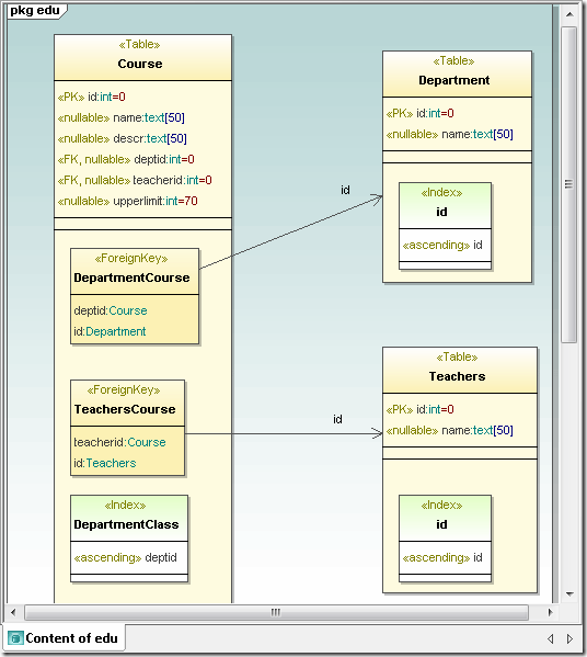
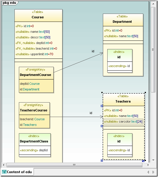
UML database diagram UModel Database Diagram Supported Databases The UModel 2011 database diagram functionality supports multiple databases and automatically adjusts SQL dialects, data types, and other specialized features for the following databases:

  • Microsoft® SQL Server® 2000, 2005, 2008
  • IBM DB2® 8, 9
  • IBM DB2 for iSeries® v5.4, 6.1
  • Oracle® 9i, 10g, 11g
  • Sybase® 12
  • MySQL® 4, 5
  • PostgreSQL 8
  • Microsoft Access™ 2003, 2007

UModel Database Diagram Elements UModel 2011 database diagrams support all the following database elements:

  • Database schemas
  • Tables
  • Views
  • Check Constraints
  • Primary / Foreign / Unique keys
  • Indexes
  • Stored procedures
  • Functions
  • Triggers
  • Database Relationship Associations
  • Database Relationship with Attributes

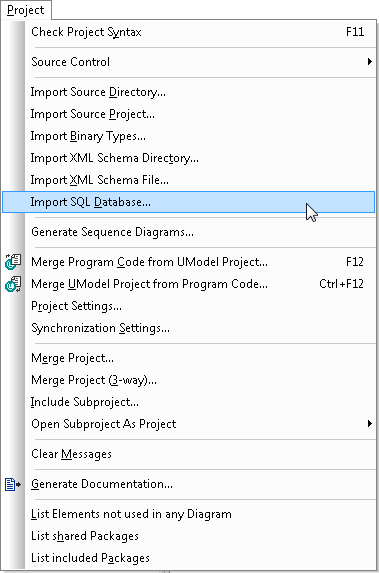
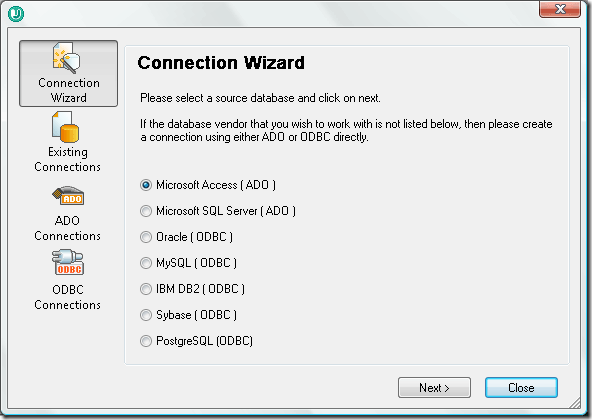
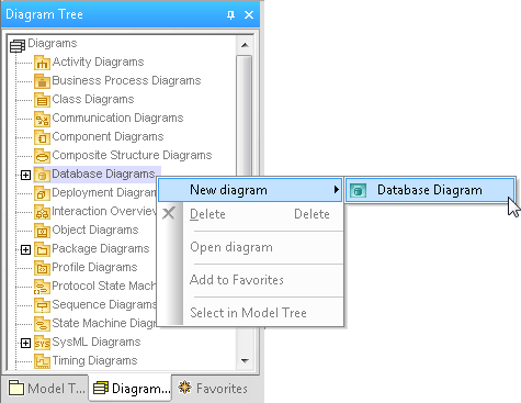
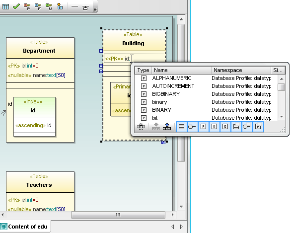
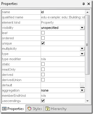
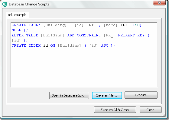
Import Existing Database Structures Users can import an existing relational database via a selection in the UModel 2011 Project menu. UModel Project menu The Import SQL Database option opens the UModel 2011 Database Connection dialog, with the Database Connection Wizard and all the additional connection options available in DatabaseSpy and other Altova MissionKit tools that interact with popular relational databases. UModel database connection dialog When importing a database, UModel 2011 also automatically adds a database profile to the project. UModel 2011 database diagrams are displayed in a special category in the Diagram Tree Helper window. UModel Diagram Tree helper window Modifying Databases in the Model UModel 2011 database diagrams use a dedicated toolbar with icons indicating database elements that are shared with DatabaseSpy, easing the learning curve between tools. UModel database diagram toolbar As editing proceeds in UModel 2011, the SQL Auto-completion helper window assists with creation of diagrams valid for the SQL database type. UModel database diagram SQL autocompletion window As an alternative to working directly in the diagram, users can also edit database elements in the Properties helper window. UModel database diagram Properties helper window Database Change Scripts When a developer synchronizes program code from the UModel project, changes in any database diagram generate a Database Change Script with SQL commands to implement the revisions. Database Change Scripts created in UModel can be saved as SQL files, executed directly in the database, or opened in a DatabaseSpy SQL Editor window via a convenient button in the UModel Database Change Script dialog. UModel Database Change Script Conversely, if another team member modifies a table directly in the database, a developer can update the UML model by merging the database changes. UModel Message window After synchronization of the UML model with the latest version of the database, the database diagram shows a new column in the Teachers table. UModel updated database diagram Like all other UModel diagram types, UModel 2011 lets users save database diagrams as image files and include them in automatically-generated project documentation. Visit the Altova What’s New page to learn more about all the new features in the Altova MissionKit 2011. Model databases along with system requirements, business rules, and application code for your next development project – click here to download a free 30-day trial of UModel 2011 today!

Tags: , , , , , ,