Tag Archive for: charts

Format Charts and Graphs for Any Mobile Device in Your BYOD Environment


One challenge in development of mobile business solutions is formatting for all the different devices end users will bring. Each mobile OS supports a family of display sizes from the smallest smartphones to the largest tablets. And when you switch to a competing OS, all the screen sizes all change again. The need to support many different mobile devices can slow down development of mobile solutions for BYOD (Bring Your Own Device) enterprises.

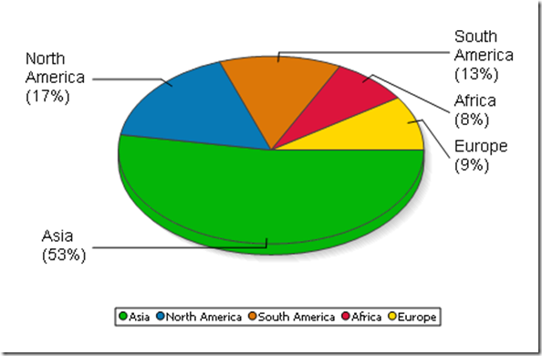
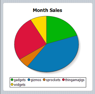
Pie chart for any mobile device created using Altova MobileTogether

Altova MobileTogether is a cross-platform mobile development framework that lets you build once across multiple platforms:

  • Android
  • iOS
  • Windows 8
  • Windows Phone 8
  • HTML-5 Browser Based Client

Going further, MobileTogether supports all available screen sizes for each OS, with special features to accelerate developer productivity.

Read more…

Tags: , , ,

Installing Altova Server Software in the Cloud


Cloud-first is becoming the new normal. At recent events we have frequently been asked about using Altova Server tools in the cloud. The answer is definitely, go for it. The installation is easy. In fact, we use Altova Server Software products ourselves for an internal reporting application, installed on local virtualized servers and on an AWS cloud instance. The charts below were generated by StyleVision Server running in the cloud to quickly communicate information about changes in dynamic data.

StyleVision Server is based on the built-in report and document generation engine developed for StyleVision and renders .SPS stylesheets originally designed in StyleVision, including features like a rich variety of charts to visually represent data.

In this post we will walk through the installation of FlowForce Server, MapForce Server, StyleVision Server, and RaptorXML Server for a complete data integration solution in the cloud.

Read more…

Tags: , , , , , ,

Web Service as a Look-Up Table to Refine GPS Data


Elevation data recorded by GPS devices is notoriously inaccurate, especially in hilly terrain like the Russian River Valley example from our earlier post.

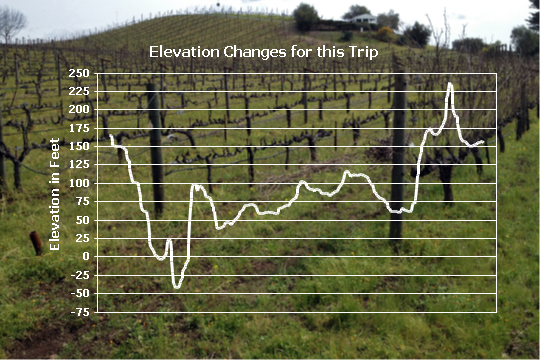
The final elevation track plotted from the Russian River Valley GPX file is suspicious for several reasons. First, the graph shows we descended almost 50 feet below sea level. That’s hard to believe, since we were travelling along the bank of the river, only about 10 miles from the Pacific Ocean.

Altova StyleVision ChartSecondly, we were headed mostly west, following the river downstream, but the track shows a predominantly uphill trend.

We can evaluate the recorded GPS elevation data by comparing it to information available from the United States Geological Survey (USGS). The USGS operates a Web service that accepts latitude and longitude coordinates, and returns elevation data measured by NASA and assessed for accuracy based on over 13,000 control points in the continental United States.

Using the elevation Web service in an Altova MapForce mapping will let us extract each point from the GPX file, send the coordinates to the USGS Web service, and build a new GPX file with corrected elevation data.

Read more…

Tags: , , , , , , , , ,

XPath Enhances XML Reports


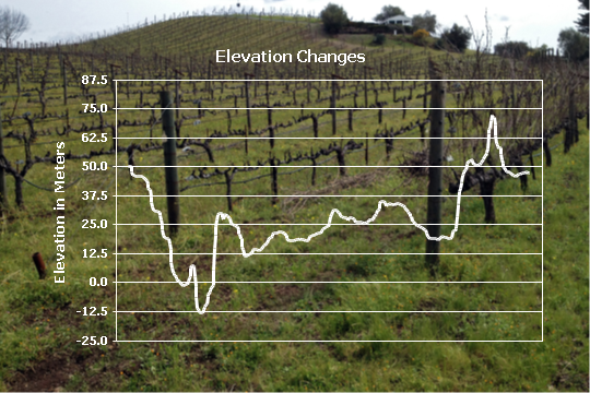
In our previous post on Creating Elegant Reports for GPS XML Data we used an XPath expression to select nodes from an XML document for an elevation line chart. You can also use XPath to compute values. Altova StyleVision includes strong support for XPath, and we can write XPath expressions to add interesting information to our GPS XML reports. For instance, we can process the elevation data stored by the GPS device in meters to plot a chart showing the elevation in feet above sea level instead.

Altova StyleVision line chart

Read more…

Tags: , , ,

Creating Elegant Reports for GPS XML Data


In our earlier post on XML for Global Positioning Systems, we mentioned that adventurers and athletes might want to use XML data from their devices to keep a record of their trips, or even training sessions leading up a marathon or other special event. Several colleagues responded by offering example files!

Looking through all this data, we realized that plotting elevation changes over time would show interesting results for many activities. We used XMLSpy to create this customized line graph directly from the XML data to show elevation vs. time for an afternoon of bicycling through California wine country. We even applied the vineyard photo as a background image right from the XMLSpy chart settings dialog.

Line chart generated by XMLSpy

Whenever you want to elegantly present data from multiple XML data files based on the same XML Schema, Altova StyleVision is the tool that lets you design a richly featured stylesheet for repeatable output in HTML, RTF, PDF, or Microsoft Word formats. Here’s how we did It for our GPS XML data:

Read more…

Tags: , , , ,

Analyze Football Statistics using the Altova MissionKit


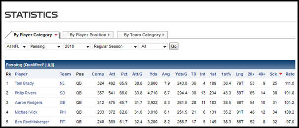
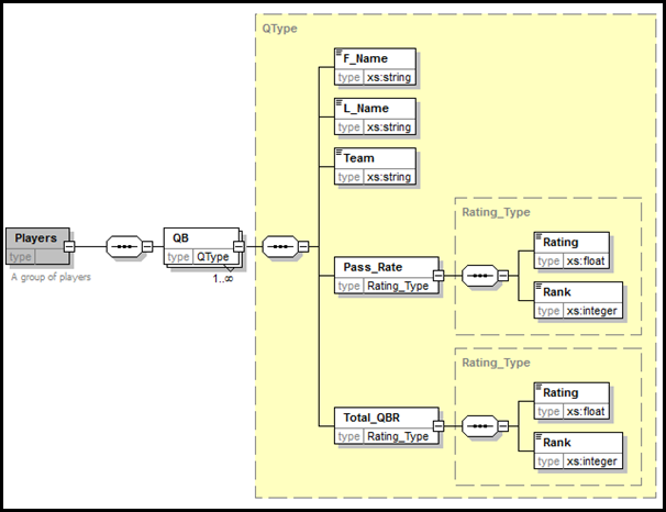
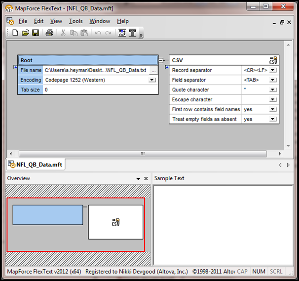
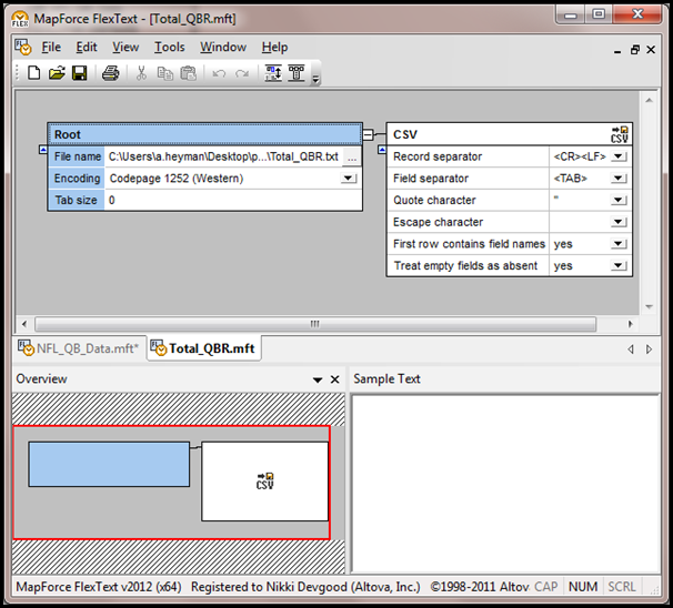
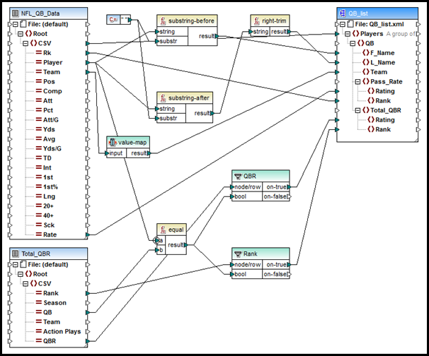
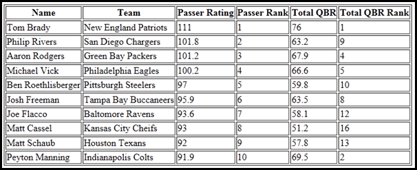
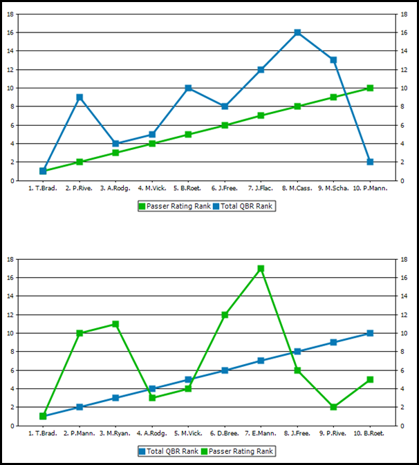
In this article we use stats from NFL.com and ESPN.com to show how easy it can be to process and analyze online data in new ways – even when it uses different metrics and is only available in textual format. We have seen in previous blog posts how easy it is to gather data from the Internet that is widely available in XML formats. But what about interesting data that is available online but not in an XML format, or data that is buried in legacy data processing systems and only available in textual report format? One such example involves quarterback ratings. The NFL has used a Passer Rating that rates quarterbacks solely based on a passer’s completions, attempts, touchdowns, and interceptions. ESPN introduced a new rating system this year called the Total QBR (Quarterback Rating). The Total QBR incorporates more data, including an expected points average and a clutch play index, that ESPN claims gives a more accurate measure of a quarterback’s performance. Let’s compare the rankings that these system produce to see if we can garner some useful information. For this example we’ll be using the data importing and analysis tools of the Altova MissionKit to compare the ratings. If you want to try this out yourself, the MissionKit is available to download for a 30 day free trial from the Altova web site. You can access the files used in this example here. The first thing we need is the raw data to analyze. Let’s use the entire 2010 season as a data source. We can get the table with Passer Ratings from NFL.com and then copy and paste it as a new text file. NFL.com_top5_passers_2010 We can access a similar table of Total Quarterback Ratings from the ESPN web site and create a second text file. ESPN_Total_QBR_Top5_2010 We now have two text files with tables of data in different orders. The next step is to combine the tables into one file and generate charts. First, we need a schema file for the destination of the data. In XMLSpy, we can create an XSD file quickly, and graphically, to contain a series of QB nodes with child nodes of first and last name, team, passer rating and rank, and total QBR and rank. QB_Schema.xsd Now, in MapForce, we open the text documents and use FlexText to parse the text and change it into a list of categories. NFL_QB_Data_FlexText Total_QBR We then build a mapping file in MapForce to map the data from the text files to the destination XML file. Built-in functions make it easy to extract the first and last names from the Player string, and a value-map will change the team abbreviation to a string (ARI is changed to Arizona Cardinals, ATL to Atlanta Falcons, etc.). We set the Priority Context in the test of our filters to make sure we get the correct set of data for each unique quarterback. QB_Schema Once we execute the mapping, we can save the resulting XML data file and use it as the source file in StyleVision to design a stylesheet. In this stylesheet, we create a table of the top ten ranked passers and charts showing the Passer Rating and the Total QBR graphically. QB_Charts1 QB_Charts2 Now that we have a visual representation of the rankings of the two rating systems, we can examine their differences and try to see which works better. For example, Peyton Manning was tenth in passer rating, but was second in Total QBR. This can be explained by the Total QBR taking clutch points into account and knowing that Peyton Manning had a few late game comebacks in the 2010 season. Since we now have a collection of files (the XSD file built in XMLSpy, the FlexText and mapping files from MapForce, and the stylesheet design created in StyleVision), we can update the text data files easily to analyze new sets of quarterback data. Later in the season, we can update the text tables with 2011 data, and allow the data to flow through the mappings and into the stylesheet to update the charts and see the rankings for the current season. This example focuses on numbers from the NFL, but this method can easily be adapted to other data sets and data sources that are accessed as text files as well as in other formats. You can learn more about how to use the products in the Altova MissionKit by taking our free online training courses.

Tags: , , , ,

Advanced Presentation and Formatting in StyleVision


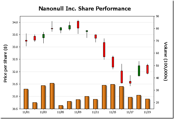
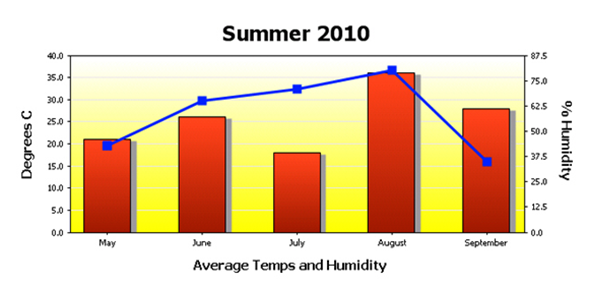
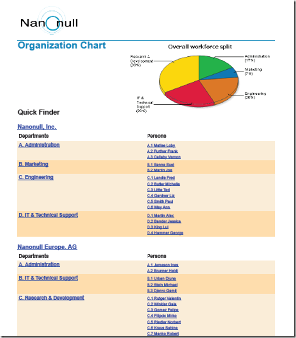
The StyleVision stylesheet and report design tool has added a plethora of advanced functionality over the past several releases. In this post we’ll explore some of the advanced presentation and formatting capabilities that make this tool so powerful. Data visualization (e.g., charts and graphs) and other graphical elements are de rigueur these days. Whether it’s showing change over time via a simple bar graph, highlighting performance with an image from the art department, presenting market data with a candlestick chart or developing a gauge for dashboard reporting, organizations today demand the ability to include sophisticated graphics on all sorts of output – including Web sites. Altova StyleVision 2011r2 can help you meet these demands with advanced presentation and formatting capabilities. You can use StyleVision to generate graphical representations of XML, database, and XBRL data for output to eForms, PDF, HTML, RTF, and Word 2007+. Advanced formatting capabilities will enable you to create impressive charts, graphs and other data views that resonate with audiences. In addition to 2D and 3D bar and pie charts, you can create line, area, candlestick, and gauge charts for use on Web sites or printed materials. Overlay reports provide you with the ability to juxtapose two data sets such as opening, high, low, and closing share prices (candlestick chart) with daily share volume (bar chart) as pictured here. Create Overlay Reports with StyleVision Comprehensive style attributes including colors, background images, legends, and even dynamic XPath settings provide you with complete control over how XML, database, and XBRL data are presented. Among pie chart attributes StyleVision users can select from, for example, are start angle, drop shadow, tilt (for 3D), color scheme (including user defined), and visibility of values, percentages, labels and legends. Create Advanced Pie Charts with StyleVision Adding background color and images is easy with drop down boxes – to achieve the yellow vertical gradient pictured in the overlay chart below simply go to All Settings under Appearance in the Chart Configuration dialog box, select Background Color in the Plot section of the General tab and select vertical gradient and the yellow color swatch from the drop down boxes.Advanced Charting with StyleVision StyleVision even offers users the ability to design templates so that output can be modified dynamically based on end user input. Below is an eForm that presents information in English and German depending on which button is toggled – conditional statements associated with a variable declared at the $XML template control this. Please note that the formatting in the Date field changes as well. Design Forms in Multiple Languages with StyleVision Design Forms in Multiple Languages with StyleVision Keep in mind that any form that you would like to reproduce in StyleVision can be imported as a “blueprint,” a configurable image that serves as a template. This allows the designer to place text, input fields, and other design elements directly on the template and makes it easy to build an eForm identical to the original. With advanced presentation and formatting for charts and graphs Altova significantly extends the capabilities of StyleVision’s already powerful report builder – your designs are limited only by your imagination. clip_image008 We’d love to hear how you are using these or other capabilities in developing your own projects. Please share your stories by posting to our Facebook wall or commenting here on our blog! If you haven’t tried StyleVision before, now is the time. Download a free, fully functional, 30-day trial from the Altova Web site now.

Tags: , , ,

Release 2 of Altova Software Version 2011


clip_image001We’re pleased to announce the availability of Release 2 of Altova’s 2011 product line, which adds numerous new features to our entire MissionKit tool suite, as well as all standalone products. Even though it’s been just five short months since Version 2011 was announced, Release 2 packs a formidable punch, delivering innovative new features to meet customer requests and provide the unique, advanced functionality you’ve come to expect in the award winning MissionKit. Below are a few details on Release 2 of the Altova MissionKit 2011. For complete information and screenshots, click over to the Altova What’s New page. Subsequent posts over the next few weeks will cover each product and each feature in more detail. Advanced Chart and Report Creation The new functionality added in the MissionKit 2011 for creating charts and reports to analyze database, XML, XBRL, and other types of data received some important updates in Release 2, including new chart types, new formatting options, and more. New chart types add to the long list already available and include area charts, stacked area charts, candlestick charts, and more. You can add even more advanced formatting options to your charts now, using background images, color gradients, and variable axis label positions, as shown in the stacked area chart below. Area chart with background image R2 also adds support for chart overlays, which combine two disparate sets of data in one chart, as shown below. This example combines a candlestick chart of a stock’s daily prices with the daily sales volume indicted using a bar chart. XML candlestick chart with bar chart overlay These new charting and reporting tools add to those already available in XMLSpy, StyleVision, and DatabaseSpy, providing multiple opportunities to visualize, analyze, and report business data in innovative ways. Other v2011r2 Highlights R2 includes a lot more than just new chart and report creation features. We’ve got some great new tools for XML Schema editing in XMLSpy, as well as fully customizable documentation generation for XML Schema, WSDL, and XBRL via StyleVision integration. MapForce provides several enhancements for data mapping, such as enhanced ETL performance through data streaming, support for the IATA PADIS EDI format, and more. StyleVision now supports barcodes and other new tools for advanced report creation and publishing. BPMN support in UModel has been updated to the latest version, 2.0, and you can also now generate code from State Machine UML diagrams. And finally, just when you thought the DiffDog diff/merge tool couldn’t be any cooler, we’ve added full support for comparing and merging Microsoft® Word docs (yes, it’s actually easy to use). Diff/merge for Word documents   All these new features are expanded on here and will also be covered at length in upcoming blog posts. Make sure you are subscribed to the blog or our Facebook page, and do check back often for updates!
Tags: , , ,

New StyleVision Training


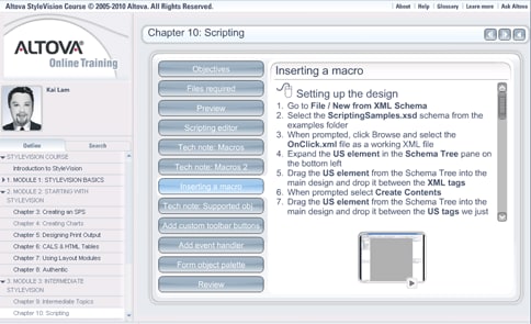
We are excited to announce the latest updates to our StyleVision online training course, which will help you easily come up to speed on the new reporting and chart creation functionality added in Version 2011, as well as how to create a StyleVision design (.SPS) based on an existing XSLT stylesheet. The final chapter in the course covers scripting, another advanced feature added in v2011. Access this chapter to learn how the scripting and toolbar editor helps you add flexibility and interactivity to the Authentic eForms you design in StyleVision. After an overview of the scripting capabilities, you’ll practice inserting macros, adding custom toolbar buttons and event handlers, and adding forms to your design. stylevision-training Like all Altova Online Training courses, the StyleVision modules are available on demand and are completely free. If you’re not a StyleVision or MissionKit customer, you can download a fully functional free trial before starting the training. We rely on your feedback and suggestions to update our online training classes and deliver the content you need most for your day-to-day work. Please let us know what you think of the new StyleVision chapters!

Tags: , , , , ,