New Software Feature: Charting in DatabaseSpy 2011
 A colorful, eye-catching chart is much more vivid and communicates meaning more quickly than a table of numeric data. As part of the v2011 launch of the Altova Missionkit on September 8, 2010, DatabaseSpy 2011 includes a new SQL charts tool that provides a wide variety of charting features to graphically represent SQL query results. DatabaseSpy 2011 supports the following chart types to provide the most appropriate representation of various data sets:
- Line charts
- 2-D and 3-D pie charts
- 2-D and 3-D bar charts
- Round gauge and bar gauge charts
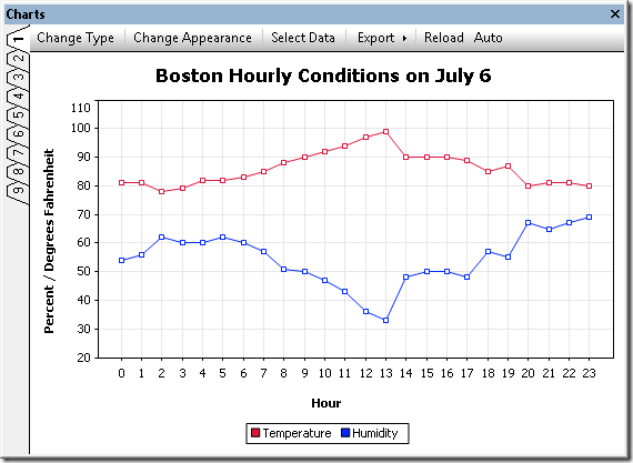 DatabaseSpy SQL Charts Tool Supported Databases DatabaseSpy 2011 supports multiple database types and can generate charts from the results of SQL queries to the following databases:
- Microsoft® SQL Server® 2000, 2005, 2008
- IBM DB2® 8, 9
- IBM DB2 for iSeries® v5.4, 6.1
- Oracle® 9i, 10g, 11g
- Sybase® 12
- MySQL® 4, 5
- PostgreSQL 8
- Microsoft Access™ 2003, 2007
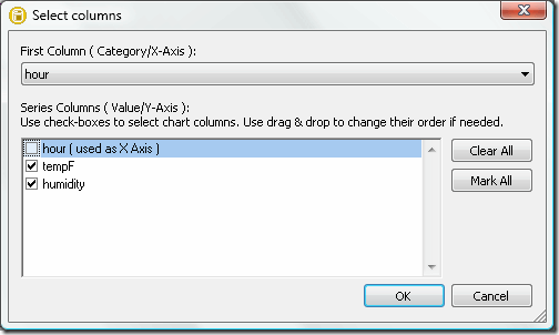
Charting SQL Query Results A link in the Altova DatabaseSpy 2011 SQL Editor Results window toolbar opens the Chart Selection dialog to initiate data charting. 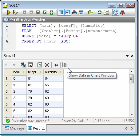 The chart tool icon opens the Select columns dialog, where users can specify which column of the Results table to use for the X-axis. Users can also change the order of value columns, or even leave one or more results column uncharted. This feature permits multiple charts to be generated for subsets of data from a single query that retrieves many table columns.
  The data is initially plotted using the default chart type and settings in a new Charts window. Like other DatabaseSpy helper windows, the Charts window can be unpinned, moved, and resized, as a floating window. The Charts window has nine tabs that permit users to specify properties of nine different charts that can even be assigned to different query results.
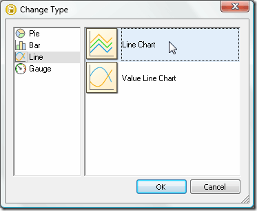
 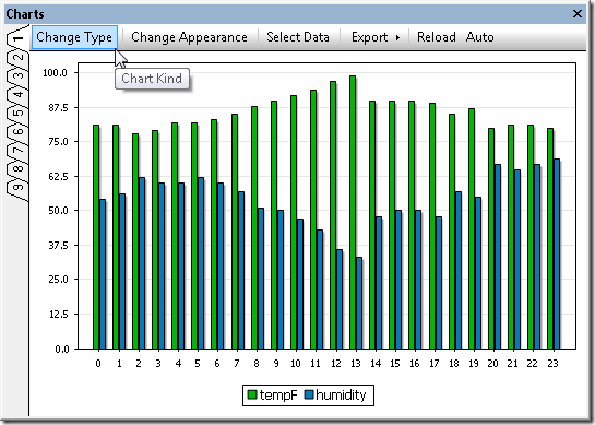 The Change Type dialog gives users instant access to a wide variety of other chart styles.
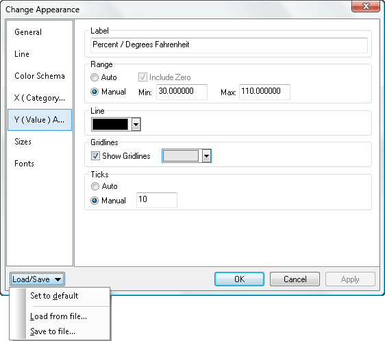
  Within each chart type, sub-menus specify all the details of the chart appearance. Numerous customization options are available for each chart type, including chart titles, foreground and background colors, definition of axis ranges and labels, control of fonts, text colors and sizes, and more. A pull-down menu also lets users save and reload customized chart settings in files, for instance to store standardized chart styles and reuse them with multiple query results. The screenshot below shows a few of the settings for the line chart at the top of this page, which illustrates the same temperature and humidity data shown in the SQL query screenshot.
  The screenshot below shows a bar chart reporting total sales for the year to date by sales territory. This is a typical example of a chart style that can be reused in a report that is frequently updated with the latest sales data.
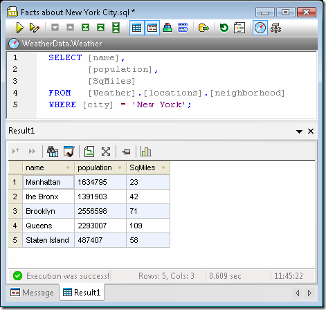
  Multiple Charts from a Single SQL Query Results Table Generating multiple charts from the same SQL query is simple and straightforward by selecting different columns of data in the Results table. The SQL query in the screenshot below returns the population and land area of the boroughs that make up New York City:
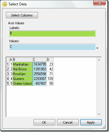
  Users can choose any tab in the Charts window, then assign data by clicking the Select Data menu option in the Charts window menu bar.
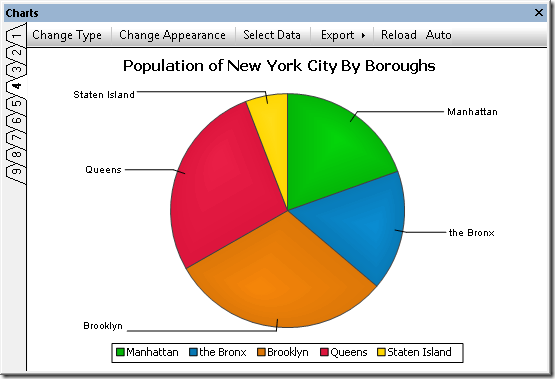
  Here are examples of an ordinary pie chart and a 3-D pie chart generated individually from the population and square miles data columns of the Results table:
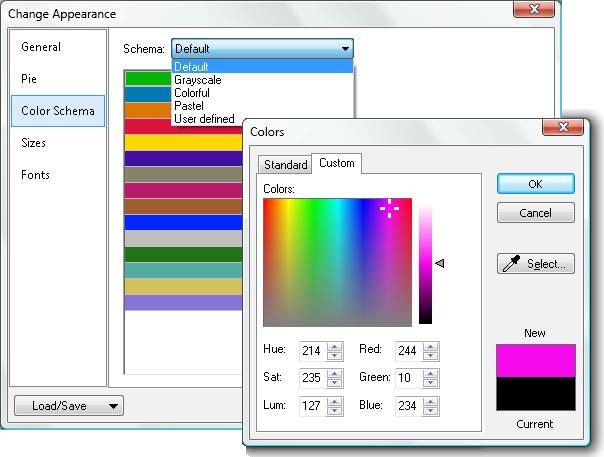
 DatabaseSpy 2011 lets users change the chart colors by selecting an alternate palette or any custom colors.
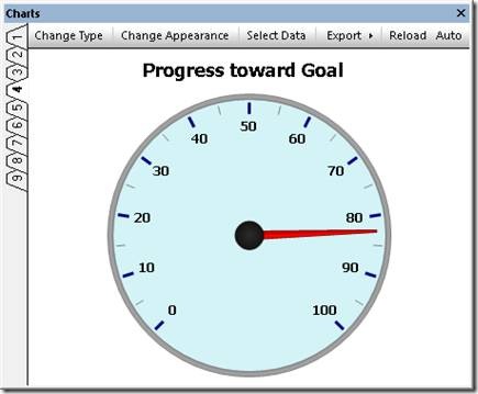
  Gauge Charts from a Single Value or Calculated Results Gauge charts are used to illustrate a single value and show its relation to a minimum and a maximum value. For a round gauge chart, users can specify the beginning and ending values of the range, and the starting and ending locations on the gauge. DatabaseSpy 2011 enables complete gauge customization through selection of the background color, border color, needle color, text font, size, and color, and more.
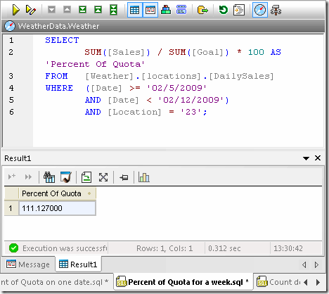
  DatabaseSpy 2011 can generate charts from results tables that contain relational data, or from results of calculations performed by SQL queries. Gauge charts are a good fit for illustrating a single calculated value. The screenshot below shows a percent of quota calculation in a DatabaseSpy 2011 SQL Editor window, based on a table of stored daily sales and sales quota data.
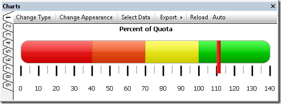
  The calculated value can be more dramatic when represented in a bar gauge chart, where DatabaseSpy 2011 permits multiple background colors defined by ranges along the axis, as shown below.
  Export Charts for Reports DatabaseSpy 2011 exports charts to image files in .png, .bmp, .gif, or .jpg files in customized sizes, independent of the size of the chart window on the screen to create eye-catching visual elements in reports of all types.
  Whether you are a developer, business analyst, research professional, or other database user, DatabaseSpy 2011 can generate elegant charts from SQL query results to illustrate your data reports – download a free 30-day trial today! If you'd like to find out for yourself how well DatabaseSpy works with other Altova tools, download a free trial of the Altova MissionKit.