Mobile App Themes Improve User Satisfaction
Mobile app themes improve user satisfaction by letting each user customize the app appearance with personal preferences. One way to implement multiple themes in apps that report and visualize data is to offer users a choice of color palettes for charts and graphs. MobileTogether uses a combination of drag-and-drop UI design, the powerful Action Tree visual programming language for event handling, and standardized functional programming for data selection and processing. Developers use MobileTogether every day to create elegant cross-platform apps with rich charts and graphs in all popular formats.
The main chart configuration settings let mobile app developers choose any of four built-in color palettes or even define a custom color palette for charts and graphs as they design an app. Combined with dark mode and light mode display settings, that creates ten colorful possibilities for display customization. Rather than impose a design-time color choice, developers can leverage MobileTogether features to let users choose for themselves. Let’s look at an example.
The image below shows the Mobile Together Color Schema selection dialog and a chart from a mobile app that reports production for rooftop solar power systems.
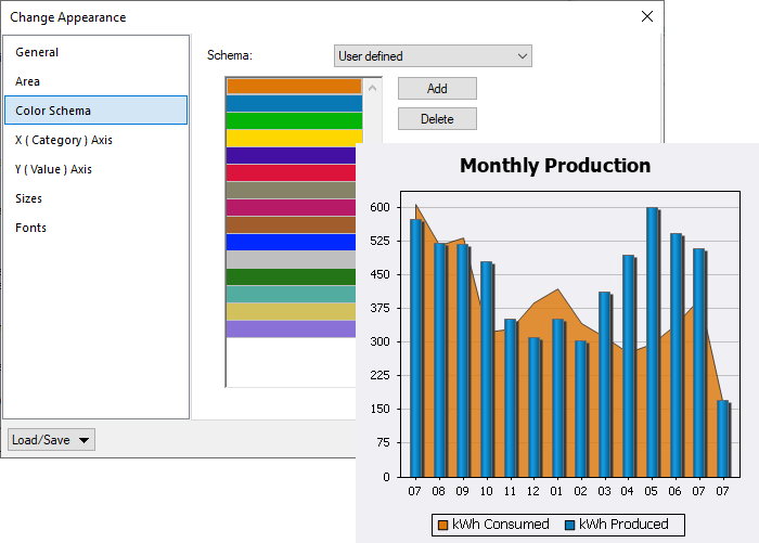
The developer assigned a custom Color Schema in the Chart Settings dialog, where the background area chart is filled with orange and the bars are blue. If the chart included additional elements, the next colors would be green, yellow, violet, etc.
The developer could have selected any built-in Color Schema from the drop-down menu:
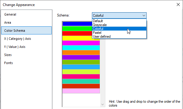
Creating Mobile App Themes
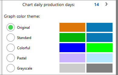
Let’s look at a strategy to empower users on any mobile device to pick a color schema when the app executes. This app already has a Settings page, so that’s a natural place to add a selector for appearance themes. We can start by creating a table with radio buttons and color swatches for each color schema. Here is a view of the completed table in the MobileTogether Designer:
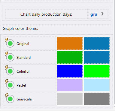
MobileTogether supports all familiar selection controls. For instance, a combo box appears immediately above the table. We chose a set of radio buttons for mobile app themes to concurrently display all the color options.
The charts in this app only include one or two elements each, so each color pair illustrates the first two colors in the list for each schema. Here is a view of the same portion of the Settings page in the MobileTogether Simulator window:
The main Chart Setting dialog lets developers quickly design the best chart to visualize virtually any data set, including area charts, bar charts, candlestick charts, gauge charts, and pie charts. Chart types can even be combined in layers. The Monthly Production chart shown above is a layer chart with a bar chart overlay.
But any individual chart feature can also be defined as the result of an XPath expression processed during app execution. Assignments in the Dynamic XPath Settings dialog override the original basic Chart Settings.
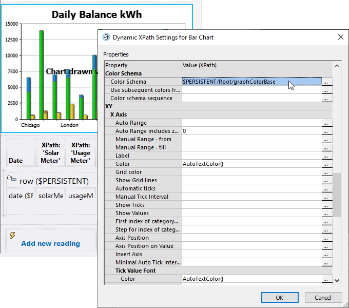
The Dynamic XPath Settings dialog lets us specify the color schema for each chart in the XML element called graphColorBase. The table of radio buttons on the app Settings page assigns one of the following string values to graphColorBase: “Default”, “Grayscale”, “Colorful”, “Pastel”, or “User”.
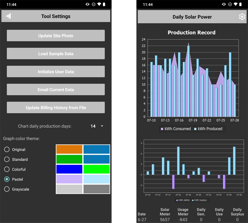
Here are screenshots of the final app showing selection of mobile app themes on an Android phone in Dark Mode:
And Standard and Grayscale color schema examples on an iPhone in Light Mode:
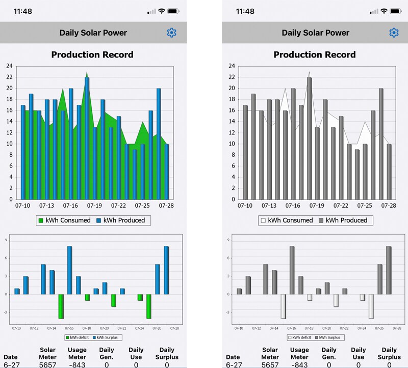
The Grayscale color schema might be perfect for colorblind users!
Take a look at our MobileTogether video demos, more sample apps, or even the online manual for a deep dive into all the info about MobileTogether. When you’re ready to improve user satisfaction with mobile app themes in your own cross-platform apps, download the MobileTogether Designer.
