Leverage Your Financial Data with the XBRL Chart Wizard–Part 2
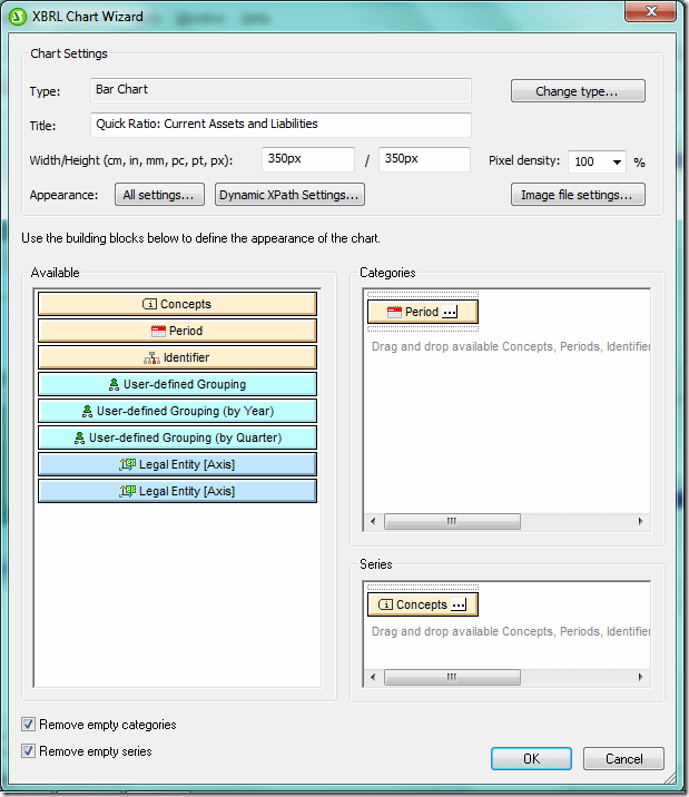
Extensible Business Reporting Language (XBRL) is an XML-based language for reporting and exchanging financial data that’s making inroads across the globe. In fact the US Securities and Exchange Commission now requires public companies to submit financial data in XBRL format.Altova’s MissionKit, a suite of our most popular software, supports XBRL tagging via XMLSpy and MapForce as well as XBRL rendering via StyleVision. With StyleVision you can create sophisticated financial reports including charts and tables based on XBRL instance files.  This is the second post in our two part series on StyleVision’s XBRL chart capabilities. In our last post we showed you how to call the XBRL Chart Wizard and create pie charts. This time we’ll show you how to create bar charts and line charts. Bar Charts Bar charts are the ideal vehicle for comparing groups of objects or visualizing change from one period to another. Here we’ve used the XBRL Chart Wizard to create a bar chart comparing Current Assets to Current Liabilities from the third quarters of two consecutive years. After invoking the XBRL Chart Wizard as we did in the very first step, we select Current Assets and Current Liabilities in the Concepts tab and place it in the Series pane so that these amounts will be reflected on the Y or vertical axis.
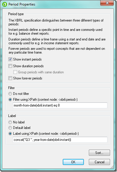
  Now we click the ellipses in the Period tab in the Categories pane to bring up the Period Properties dialog box. Assets and Liabilities are measured at specific points in time and so we have checked the Show instant periods box. We’ve also filtered the data using XPath so that only assets and liabilities at the end of the third quarter (which ends in August) appear. Finally we add a dynamic label that combines “Q3” with the year using XPath.
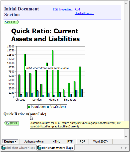
  In addition to the bar chart, we’d like to include the Quick Ratio, a measure that indicates whether an organization has enough readily liquidated resources to cover outstanding financial obligations. The Quick Ratio is simply Current Assets divided by Current Liabilities. We’ve added an auto calculation and used XPath to divide Current Assets by Current Liabilities for all time periods in the XBRL instance document. Below is the design view of our bar chart and auto calculation, including the XPath.
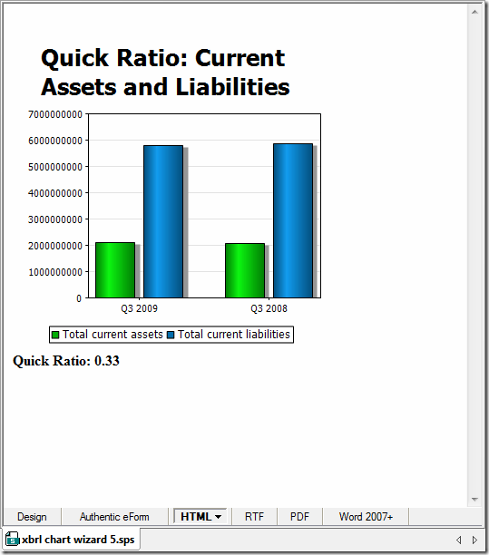
  The HTML output appears below. However we can also render the design in RTF, PDF, and Word 2007+.
  Line Charts A line chart has a line connecting discrete points plotted on a graph and is typically used to track how financial and other data varies over time. In this example we’ve created a line chart to track two concepts – costs / expenses and revenue – over a four year period. Just as we did for the pie chart and bar chart, we’ve dragged a concept (here, Revenues) from the Schema Tree into the design window and invoked the XBRL Chart Wizard. Likewise, once the Chart Wizard opens, we clicked on the ellipses on the Concepts tab in the Series pane to bring up the Concept Properties dialog box, where we selected the Costs and Expenses concept. Costs and Expenses will now appear on the chart along with Revenues. Our XBRL file includes both instance and duration time periods so in the Period Properties dialog box below (invoked by clicking on the ellipses in the Period tab in the Categories pane) we’ve selected only duration periods, or those with a start and end date. We will now use XPath to filter the data. We’ll create a variable $altova:duration that translates the difference in number of days between the start and end dates of the period into the number of months and then selected data where that variable is equal to three (equivalent to a fiscal quarter). We’ve also used XPath to create a dynamic label combining Q3 with the year.
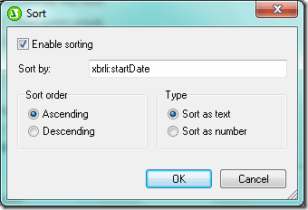
 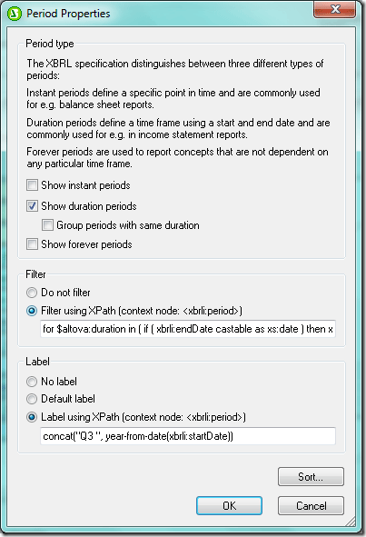 Because our line chart is visualizing changes in revenue and costs and expenses over time, we have used the Sort function in the Period Properties dialog box above so that the data appear chronologically.
  Although the appearance of the chart (e.g., colors, labels, and visibility of tick marks and axis values) can be controlled with the All Settings button in the Chart Settings section of the XBRL Chart Wizard dialog box, it can also be controlled with XPath via the Dynamic XPath Settings button under Chart Settings (below).
 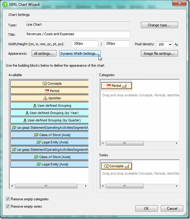 This feature provides tremendous flexibility not only in managing appearance but in managing the contents of the chart. Among the many things you can do with XPath are controlling output based on conditions and adding a dynamic title that includes the time period reflected as we’ve done here. Once you click the Dynamic XPath Settings button in the XBRL Chart Wizard dialog box (above), the Dynamic XPath Settings dialog box is invoked (below).
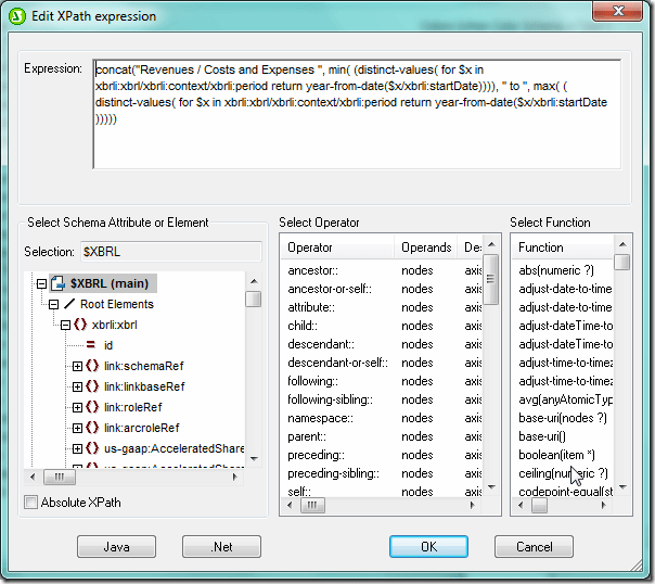
 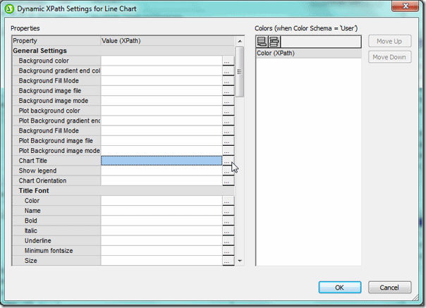 Clicking the ellipses next to the property that you want to edit in the Dynamic XPath Settings dialog box (above) brings up the Edit XPath Expression dialog box (below). Here we’ve used XPath to concatenate a string (“Revenues / Costs and Expenses”) with the first and last years in the period we identified in the Period Properties dialog box earlier.
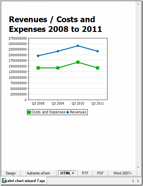
  The XPath expression entered here will overrule the settings in the Change Appearance and XBRL Chart Wizard dialog boxes – notice in the chart (here rendered in HTML) includes the dynamic title that we built with XPath rather than the title in the XBRL Chart Wizard Dialog Box.
  As we’ve shown here, the XBRL Chart Wizard provides developers and designers with a highly flexible tool for visualizing XBRL data. With XBRL’s place in the international technology sector firmly established, the ability to leverage XBRL data to support strategic decision making is key. There are a number of different types of companies that are discovering the strategic value of XBRL. Our XBRL case study describes how the Maryland Association of CPAs streamlined their tax reporting and benchmarking processes with XBRL. This case study is a great resource for anyone interested in learning how to leverage this data with Altova software tools.
Have you created something really great with the XBRL Chart Wizard? Or developed an interesting project using StyleVision or another of our tools? Please share your story with other Altova users by commenting on this blog post. Think it would make a great case study? Email us at marketing@altova.com – if we choose to use your story you’ll receive a $200 Amazon gift card as well as some free press for you and your organization. We’d love to hear from you!
