Scrolling Tables for Data-Driven Mobile Apps
Mobile device users always demand maximum information in the most convenient package, but small screen sizes can force a trade-off. Mobile app developers are challenged to fit data, navigation controls, and helper information all into a pleasing layout or risk frustrating end users who could be customers, colleagues, or c-level executives. MobileTogether 2.1 introduces scrolling tables and other cool new features to help developers create apps that present data elegantly and work the same way on all devices.

Scrolling Tables
MobileTogether 2.1 lets developers define tables that can scroll horizontally or scroll vertically between a header and footer that remain in stationary positions. Horizontal scrolling lets developers display more columns of a wide table without reducing text to an illegible size. Vertical scrolling can allow important anchor information to remain on the screen at all times, improving clarity.
Vertical scrolling is especially useful for tables with repeating rows, since the developer doesn’t know at design time how many rows of data can ultimately be displayed on any user’s screen. Shown below is a simple 4-column table with repeating rows created in the MobileTogether Designer:
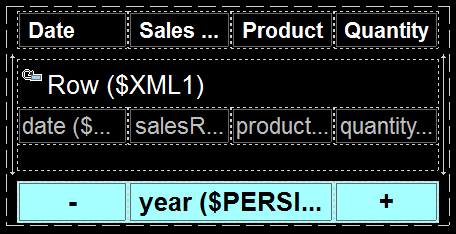
We defined the number of columns, dynamic rows, and header and footer rows in the New Table dialog, then we added labels to the header column, controls to the footer, and specified properties for text sizes and colors.
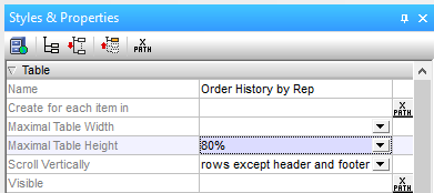
We can implement vertical scrolling by defining the maximum table height in the Styles & Properties helper window, then choosing whether the whole table scrolls, or only the inner rows between the header and footer. The maximum height can be a percent, a specific number of pixels, or you can choose to automatically fill the rest of the screen.
For developers who want to maximize the live area of the screen for presenting data, MobileTogether 2.1 includes a new Page property to hide the page title bar:

The light blue footer line of our table contains navigation features that let the user select a different month or year. The year column in the center of the footer was created using the Join button in the MobileTogether toolbar to combine columns 2 and 3 into a wider control. You can join columns horizontally or vertically, or split them again later if you change your mind. You can even embed an entire new table inside an existing cell to create a hierarchical table to design the perfect layout for complex data.
![]()
Vertical Lines
MobileTogether 2.1 also introduces a new vertical line control. If you want to add a vertical line between columns of any table, simply grab one from the Controls helper window and drag it into position, as seen in the Designer view below. The vertical line is dropped into a new table column, and you can set the column width property to “wrap_content” to take the minimum space.
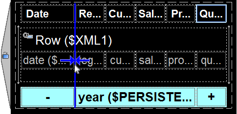
The properties of vertical lines can be adjusted just like horizontal lines. The Styles & Properties window for each vertical line lets you specify the line width, style, color, and left and right margins in pixels.
MobileTogether lets you define the visibility of any component based on orientation. The 6-column table shown above is an alternate version that will be displayed only in landscape orientation, as indicated by the landscape icon on the left side. Our original 4-column table can be set to display only in portrait mode.
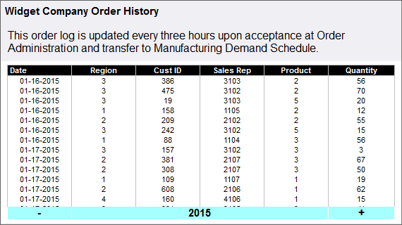
The screenshot below shows the final deployed scrolling tables app running on an Android phone held in landscape orientation. The user can scroll through rows of data with vertical swiping motions inside the table and the other elements all remain in place. The – and + controls in the footer are navigation tools to select the previous or next month.
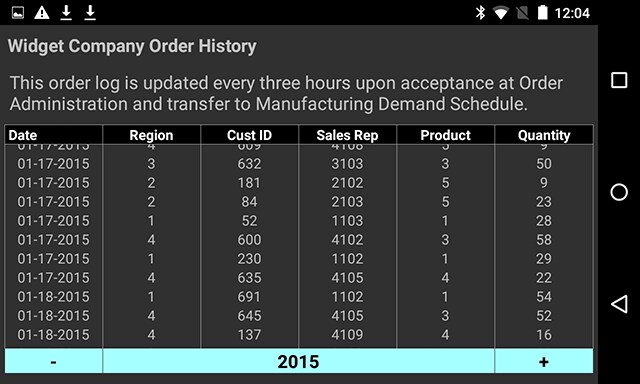
A device with a different screen size may show more or fewer rows of data, but the table still fills the maximum height we defined by percent:
The MobileTogether Designer is free to use, so download a copy today and get started with scrolling tables for your own cross-platform data-driven mobile app!

It is one of the best and easy way for the users to get the data if scrolling tables available in business app. You can say that it is great invention for app users and helps a lot.