Delight Users with Mobile App Features Tailored to the Device
An incredible variety of mobile phones and tablets exist in the world today and new models are announced continuously. All these mobile devices have different specifications and capabilities, which can be a problem for developers creating mobile apps. Tablets have large screen sizes, but don’t necessarily include cellular data, default color sets vary by phone manufacturer, and built-in mobile features may behave differently in each mobile operating system. Fortunately, the MobileTogether Designer provides an integrated development environment that lets users quickly design and build cross-platform mobile app features ideally suited to each end-user’s device.

Three unique capabilities in the MobileTogether Designer support cross-platform development:
- The built-in execution Simulator lets developers see how their app looks and runs on different devices
- An extensive set of global variables gives the developer access to the characteristics of the end-user device and permit definition of conditional operations based on the device
- Device dependent visibility – by default, any control added to an app is visible on all devices, but developers can set visibility of any control to be device-dependent
Working in the MobileTogether Designer lets you develop apps that work smoothly and elegantly on all devices, including iPhone, iPad, Android, as well as Windows 8 and Windows 10 workstations. At the same time your app can take full advantage of more powerful features where they are available.
We implemented several device-dependent mobile app features in the Geolocation Demo App discussed in our recent post titled REST Services as Data Sources for Mobile Apps. In that post we published screenshots of the completed app running on an iPhone, but as we developed the app, it was useful to run it in the MobileTogether Simulator to see how it would look on different devices.
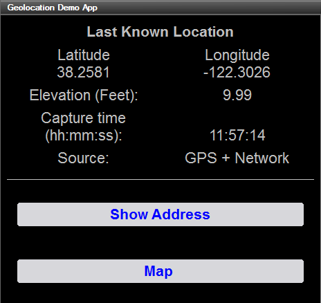
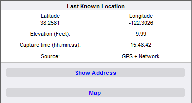
Below is a partial view of Simulator window showing the same app running on different devices.
Android:
iOS:
Windows Phone:
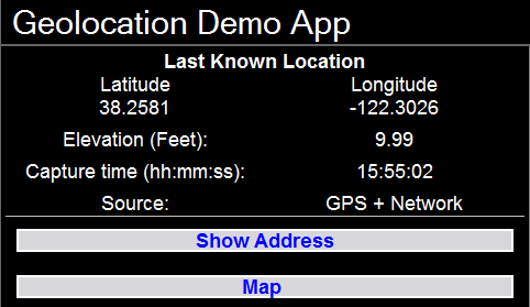
All three illustrations incorporate the same information and controls presented by the mobile app. Differences in the display across devices come from variations in screen size and differences in the user interface across operating systems.
Our app includes a Settings page that allows end-users to set app preferences. This page incorporates device-dependent behavior, since different mobile operating systems have different capabilities. Here is a view of the Settings page in the main Design window:
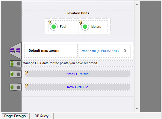
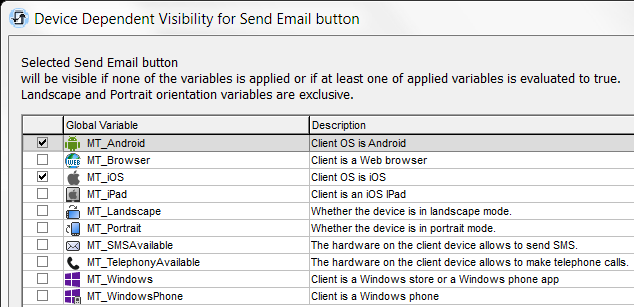
The tabs at the left edges of controls in the center of the screen define which mobile devices will display these items. To set device-dependent visibility, the developer simply creates the control normally, then uses a right-click context menu to open the device-dependent visibility dialog. In our page the GPX File buttons are intended for Android and iOS devices, but not Windows, so the appropriate entries are checked in the visibility dialog.
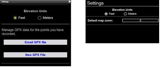
When we run the app in the Simulator, we can preview the controls on each device. Shown here is the Settings page simulated for Android on the left and Windows Phone on the right.
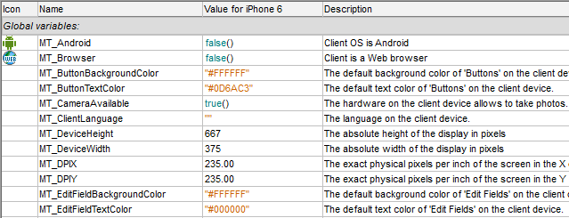
The Designer also lets developers define actions to be taken based on the values of global and local variables that store data about the end-user’s device. There are more than two dozen global variables for information about the operating system and physical device characteristics, and over a dozen local variables where values can change as the app executes. Local variables allow developers to create specialized displays for portrait and landscape orientations, for instance. Shown below is a portion of the list of Global variables.
Our demo app is designed to allow Android and iOS users to collect all their recorded GPS points in a file, and send that file as an email attachment. The Windows Phone operating system does not allow external apps to create email file attachments as easily, so we won’t implement that feature for Windows Phone, and we don’t need to build the file.
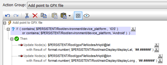
MobileTogether lets us define an Action Group to add the latitude and longitude of each point to the file only if the end user is running Android or iOS, as seen here:
On the other hand, Windows Phone has more elegant zoom behavior when plotting addresses on a map than other operating systems, so we allow Windows users to choose the map zoom factor on the Settings page.
If you would like to try out device-dependent behavior in the MobileTogether Designer for yourself, download the MobileTogether Designer – it’s free to use – and get a copy of the geolocation demo app and associated files on GitHub at https://github.com/altova/MobileTogether-geolocation-example.
