Format Charts and Graphs for Any Mobile Device in Your BYOD Environment
One challenge in development of mobile business solutions is formatting for all the different devices end users will bring. Each mobile OS supports a family of display sizes from the smallest smartphones to the largest tablets. And when you switch to a competing OS, all the screen sizes all change again. The need to support many different mobile devices can slow down development of mobile solutions for BYOD (Bring Your Own Device) enterprises.
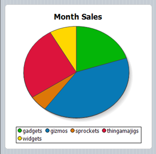
Altova MobileTogether is a cross-platform mobile development framework that lets you build once across multiple platforms:
- Android
- iOS
- Windows 8
- Windows Phone 8
- HTML-5 Browser Based Client
Going further, MobileTogether supports all available screen sizes for each OS, with special features to accelerate developer productivity.
Global Variables to the Rescue
The MobileTogether Designer gives you access to a library of more than three dozen Global and Local variables you can use for many purposes during design of your mobile solution. Global variables are static, meaning they do not change during execution of your solution. Local variables are dynamic and may only be available in certain circumstances.
Many Global Variables hold values for the device executing the mobile solution at runtime:
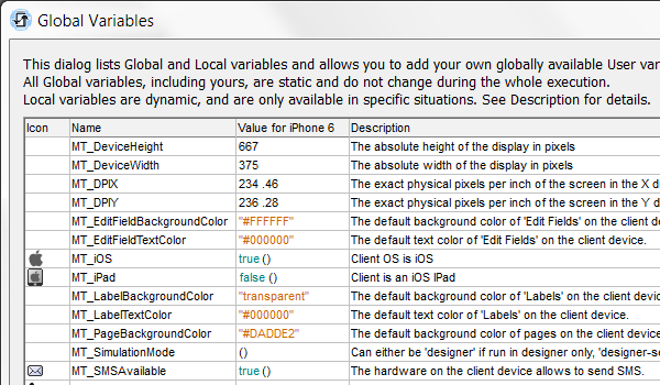
You apply Global Variables directly in the MobileTogether Designer Properties window, or you can create functions that include Global variables and define outcomes based on the result.
If you can’t find a particular variable your design requires, you can even define your own User variables. Of course all these variables are available in addition to elements in your data sources that can hold values you might also apply in functions.
Set a Variable Chart Size
If you assign the Global Variable $MT_DeviceWidth as the Chart Creation Width in the Properties window, at run time your chart will automatically fill the width of any device held in portrait mode, regardless of its mobile operating system or screen size.
You don’t even have to define the chart height. The height is generated automatically so the entire chart can be viewed without scrolling.
You can also use Global and Local variables with Device Dependent Visibility, a selection in the context menu, to define behavior for specific conditions, such as portrait vs. landscape orientation. The Widget Sales Data solution on the Altova MobileTogether Demo server demonstrates how to apply local variables to chart data in different ways based on device orientation. For example, the Sales By Region page shows a line graph in portrait orientation or a 3-D bar graph in landscape.
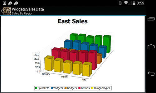
The Widget Sales Data solution is included in the examples installed with MobileTogether Designer so you can examine it to see how it was built.
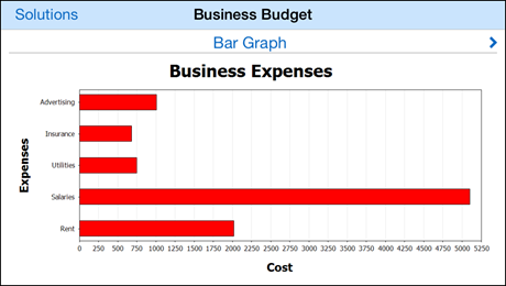
Charts defined by $MT_DeviceWidth stay the same size when the device is rotated and don’t use the device real estate effectively, as seen in the bar graph example below.
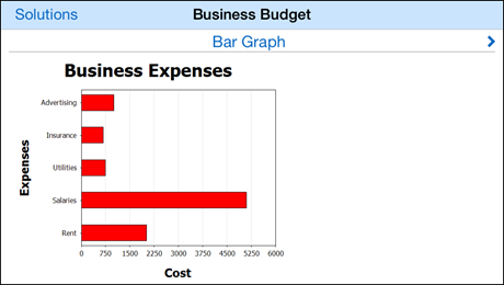
A better alternative Global Variable is $MT_CanvasX. The value of $MT_CanvasX changes when the device is rotated and the chart is automatically redrawn. If we use $MT_CanvasX to define Chart Creation Width in the Properties window, the chart is redrawn more elegantly to fit the screen in landscape orientation, with more room for legend text along the horizontal axis.
You can watch a video demonstration of chart creation in MobileTogether Designer on the Altova Web site, or download a free trial including more than 30 example solutions and get started building your own!
