Intuitive User Interface Features
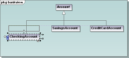
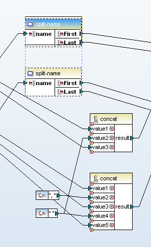
Here at Altova we like to share user interface features across products to give the MissionKit a consistent look and feel, and to help users leverage experience gained using one tool to get up to speed more quickly with the others. In version 2012 we introduced new visual alignment guides in both UModel and MapForce to make it easy to work very rapidly, yet still produce a neat, organized result that communicates effectively with other team members. As users drag elements in the diagram window, alignment snap lines appear automatically to allow any component to align with any other component.  In the UModel class diagram shown above, the developer has collapsed the properties and operations compartments to concentrate on class associations. As the CheckingAccount subclass is dragged upwards on the screen, a visual alignment guide appears and offers instant snap-to alignment with the other subclasses of the Account class. Complex data mappings in Altova MapForce might include dozens of components, functions and constants, and visual alignment guides can help organize the mapping view. In the screenshot below, the developer used alignment guides to collect split-name functions together, while concat functions are aligned in a separate group.
  Constructing the mapping diagram this way can greatly clarify the developer’s intent when multiple complex string manipulations are needed! Of course, aligned components also improve the value of printed diagrams that become part of the permanent documentation for UModel and MapForce projects. We also understand that not everyone likes to work the same way. If you prefer not to see guide lines and to turn off automatic alignment, this feature can be deselected in the Tools / Options menu selection in both UModel and MapForce. If you’d like to see for yourself how intuitively tools in the Altova MissionKit 2012 work together, click here to download a free trial!
